Beyond bar charts, Part IV: Putting data in a circle without losing the plot

Circular charts have a persuasive advantage: they look finished before we’ve worked out what they mean.
A ring of ribbons suggests a complicated system. A colourful radial profile suggests a carefully measured score. Sometimes those impressions are deserved. Sometimes we’ve given a small table a rather expensive haircut.
We’ll use a fictional library network to make two circular charts earn their place. A chord diagram will show book transfers between branches. A pizza chart will show one branch’s position on several metrics. The questions differ, even though both answers fit inside a circle.
pyCirclize handles the relationships. mplsoccer supplies the radial profile through PyPizza. The latter was built for football analysis, but its parameters can describe other subjects. We won’t need a player photograph, a football dataset, or a theory about expected goals.
The previous post counted overlapping memberships. Here we will work with directed movements and relative ranks. The examples are self-contained.

Decide what crosses the ribbon
Our transfer table counts book movements in one month. Rows identify the sending branch and columns identify the receiving branch. A book transferred twice contributes two movements, so these are neither unique titles nor unique physical books.
That definition belongs near the chart. A figure labelled merely “library activity” would invite readers to interpret whichever kind of activity they had in mind.
We use the usual assortment of three base packages, NumPy, Pandas, and Matplotlib. Then we add pycirclize and mplsoccer.
As usual the python code blocks below, run in oder. Both datasets are invented, and the profile generator uses a fixed seed.
There are 171 movements. North sends 70 and receives 51; Central sends 47 and receives 66. Those totals help us check the chart, but they don’t tell us which route is busiest. The individual cells retain that information.
The zero diagonal means that movements within a branch are outside our transfer definition. In another dataset, a diagonal entry might have a valid meaning. We set it to zero because of the data model, not because a self-link looks awkward.
Separate sending from receiving
A directed relationship needs a visible direction convention. We’ll give each branch two sectors: one for outgoing transfers and one for incoming transfers. This uses more labels, but it makes the start and end roles explicit.
pyCirclize accepts a matrix DataFrame. Renaming its rows and columns lets us distinguish the two roles without changing the underlying counts. Its chord diagram examples show this matrix-based interface.
A chord diagram showing book transfers between sending and receiving branch sectors.

Ribbon width encodes the transfer count. The broad North-to-Central connection corresponds to 48 movements, the largest cell in the table. Labels identify each endpoint’s role, while direction=1 adds directional link shapes from the row sector to the column sector.
Sector sizes reflect the traffic attached to them. They don’t describe branch population, floor area, or collection size. The two North sectors share a colour because they refer to the same branch, even though their roles and totals differ.
Every movement contributes to one sending sector and one receiving sector. Adding all six sector totals therefore counts the traffic twice. The matrix sum, 171, is the movement total; 342 would be a total of endpoints.
This is one reason it is useful to have the plain table ready as well. A circular display makes it easy to forget which quantities are being duplicated for layout.
Keep a rectangular version nearby
Following a few wide ribbons is pleasant enough. Finding the precise difference between two narrow ones is less so. A heatmap keeps the same information on a regular grid with explicit values.
A labelled heatmap of the transfer matrix, with sending branches in rows.
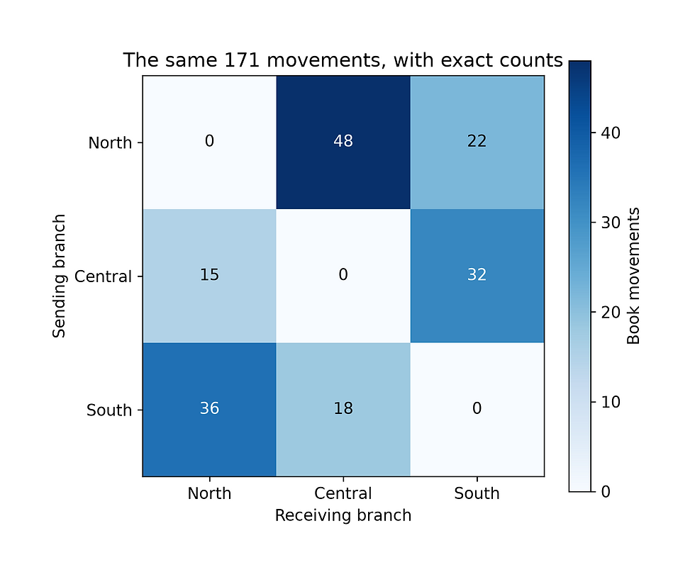
For this tiny network, the heatmap is probably the more efficient working chart. The chord diagram can still suit an overview where the relationships themselves are the story. Choosing between them depends on what we expect the reader to do: follow connections, compare cells, or retrieve exact values.
With dozens of branches, ribbon crossings can overwhelm the circle. You can aggregate branches into regions or focus on selected routes, but those choices change the displayed system. A cleaner picture may cover less data.
If we suppress routes smaller than 30 movements, calculate the loss explicitly:
That removes 55 movements, or 32.2% of the total. It’s a substantial omission for a chart that might simply look less cluttered. If you plot visible, put both the threshold and the omitted share in the caption. Sector sizes will now reflect retained routes rather than each branch’s full traffic.
Keeping the original matrix also makes it possible to revisit that decision. Never overwrite the source totals just because the first figure has too many ribbons.
What else can one put into a circle with this package
pyCirclize goes beyond chord diagrams. Each sector can contain concentric tracks of line plots, scatter plots and bars, letting you place several measurements around the same circle. For example, a sector for each branch could show monthly activity on one track and customer satisfaction on another. The package also supports radar charts, annotated genome diagrams and circular phylogenetic trees. In Jupyter, optional interactive tooltips let readers inspect supported plot elements, although these require a live notebook session and won’t carry over into a saved PNG. See the pyCirclize documentation for more information. As example we will just leave the following here

A profile needs comparable measurements
The second question concerns a branch’s characteristics. We’ll compare opening hours, event attendance, seats, digital loans, and reservation waits across a synthetic network of 20 branches.
These quantities have different units and directions. More opening hours may mean better access. Fewer waiting days may mean faster service. Drawing the raw values as adjacent wedges would make the largest numerical unit dominate the picture.
A percentile profile puts each metric on a relative scale within a comparison group. Here, a high percentile means more of the first four measurements and fewer waiting days. That is a declared display convention, not a claim that maximising every metric is a sensible library strategy.
This uses pandas’ average-rank convention for ties, divided by the number of observations. With 20 untied values, the available ranks run from 5 to 100 in steps of five. Other percentile definitions can produce different numbers, so we’ve made ours explicit.
The comparison group matters more than another decimal place. A small neighbourhood branch and a central library may have different purposes. For real reporting, compare plausible peers and state the reporting period and eligibility rules. Our random network demonstrates the mechanics only.
Baking the pizza chart
PyPizza draws one radial slice per parameter. We pass it already-calculated percentile values, so the plotting code doesn’t have to know whether a raw metric measures hours or waiting days. The mplsoccer example gallery includes additional styling and comparison variants.
A pizza chart showing one branch’s percentile ranks across five metrics.
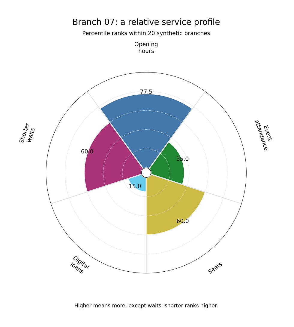
The numbers describe separate rankings. They don’t add up to 100%, and the circle does not represent a whole divided into parts. This is a frequent source of confusion because the chart resembles a pie while answering a different question.
A value of 80 means the branch has a high relative rank under our convention. It doesn’t mean 80% of a service target was achieved. A network where every branch has long waits still has a branch with the highest wait-related percentile.
Read radial extent and the printed value rather than wedge area. With equal angles, area grows nonlinearly with radius; a long slice can look disproportionately dominant. The visual impression also depends on parameter order. Reordering slices changes which colours and lengths sit together even though every value stays the same.
For comparisons across branches, keep that order fixed. Otherwise readers may interpret layout differences as differences in performance.
There is a lot, if you are into soccer
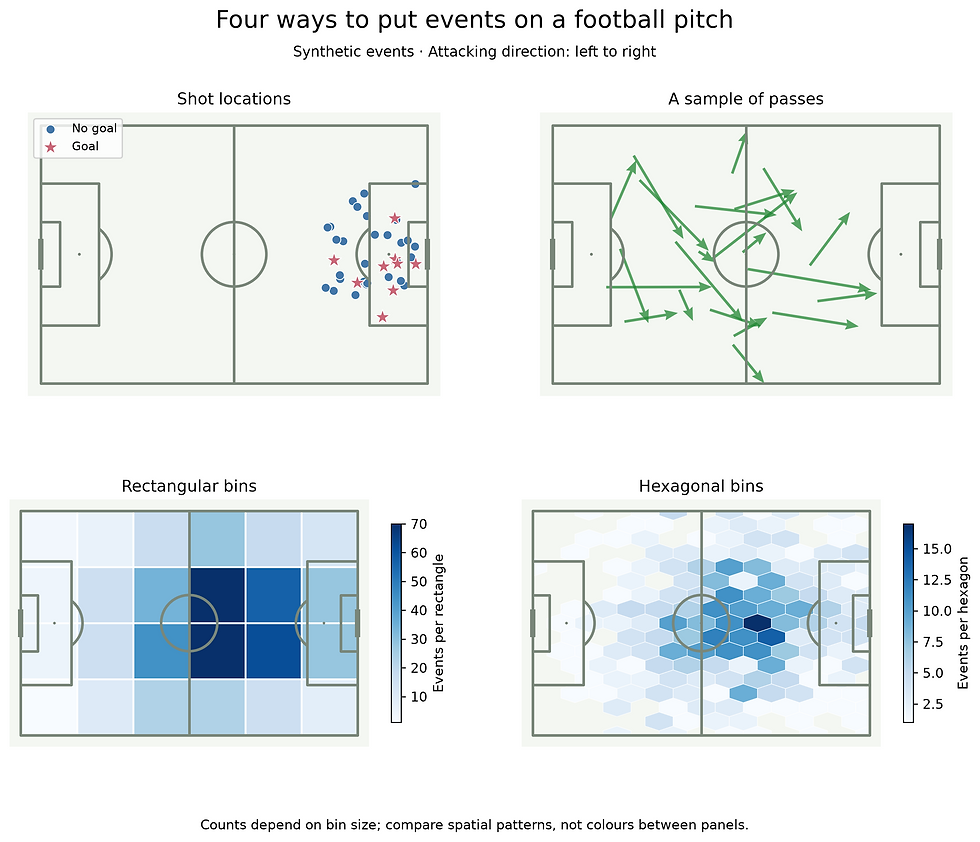
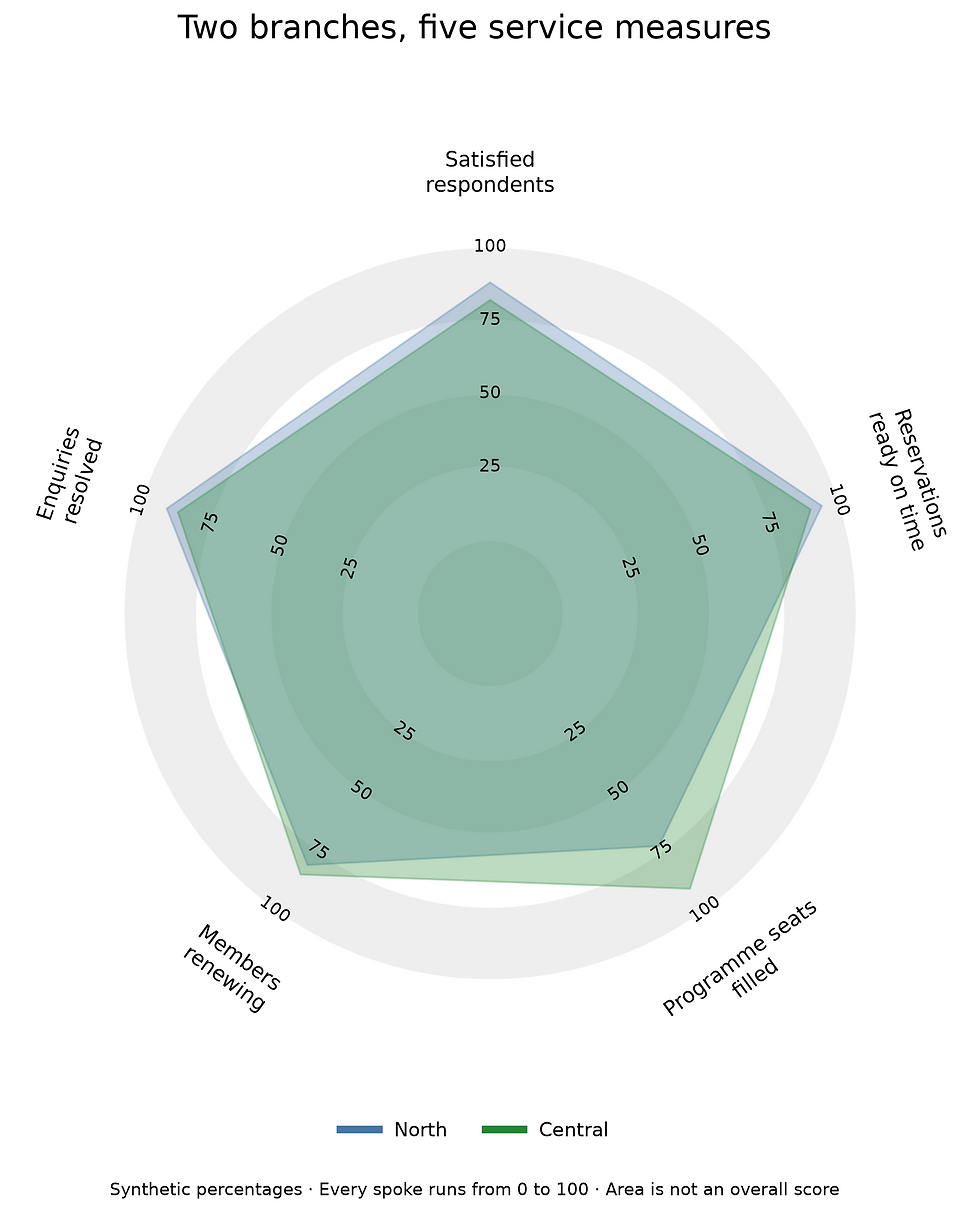
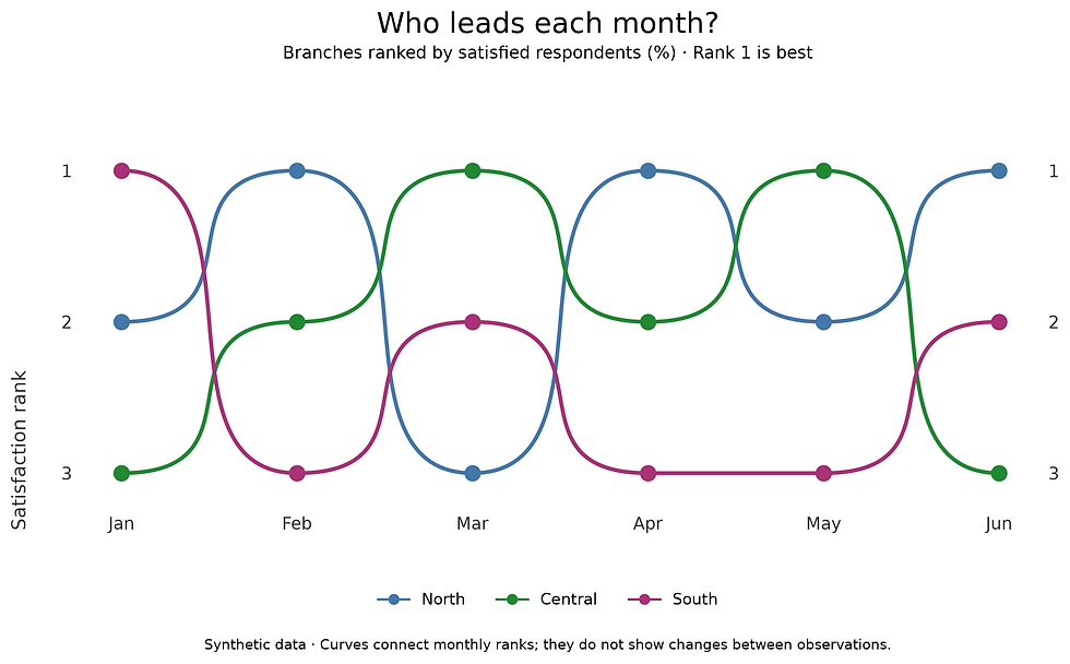
mplsoccer has plenty beyond pizza charts, particularly for football analysis. Its Pitch class draws pitches and supports overlays such as shot locations, passing arrows, heatmaps and hexagonal bins. It can also load StatsBomb open data into pandas DataFrames and standardise coordinates from different pitch systems. Outside football, its radar charts offer another way to compare profiles, while its bump charts show how rankings change over time. For the branch example, a bump chart could follow each branch’s monthly ranking, adding a time dimension that the pizza chart’s single snapshot doesn’t show. See the mplsoccer documentation, but for now here are some examples of what it can create:
Let the ordinary chart challenge the interesting one
The pizza is a compact profile for one branch. If someone wants to compare exact ranks, bars provide a shared baseline and readable labels without any radial interpretation.
The same branch profile shown with horizontal bars and numerical labels.
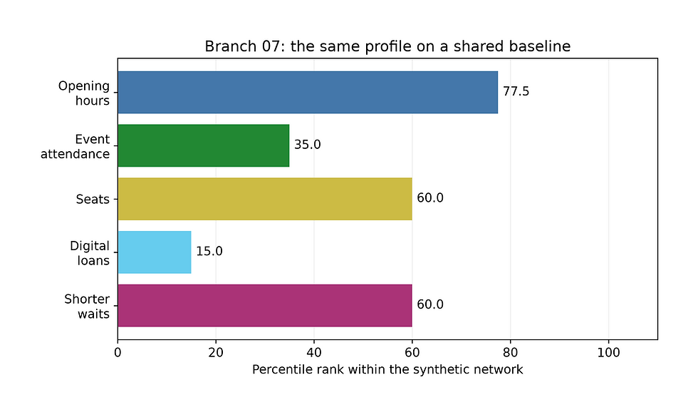
Branch 07 has an opening-hours rank of 77.5 but a digital-loans rank of 15. Its raw values are 56 opening hours per week and about 1.7 digital loans per member. The profile suggests two areas to investigate; it does not establish whether either value meets local needs.
In both chart cases, the actual raw-value table should not be far away for investigations. Percentiles compress numerical differences: neighbouring ranks may represent a tiny gap or a large one. They also move when the peer group changes, even if the selected branch’s raw values remain identical.
Missing metrics need their own treatment. Pandas ranks each column over its available observations, so incomplete data can give different comparison populations for different slices. Check coverage before plotting rather than presenting those ranks as if they shared one denominator.
pyCirclize saves us the work of allocating sectors and drawing links. mplsoccer supplies a convenient profile display. Neither library decides what counts as a transfer, which peers are comparable, or which direction means better service. Those decisions remain in the table preparation and the caption.
Use the circle when its arrangement helps the reader follow relationships or recognise a profile. Keep the rectangular view close enough that someone can check the numbers without tracing a ribbon with their finger.
Comments