Beyond bar charts, Part I: Waffles, triangles, and the trouble with percentages

Updated: Sep 20
In this series, we want to have a look at different plotting packages that build upon Matplotlib. These are not necessarily exotic and many of them you might know from the standard plotting options in PowerBI and similar applications, but it is good to know where one can get them for use in Python.
For this we look at the following situation: A report says that 60% of support requests are straightforward. That sounds reassuring until we discover that one office handles almost nothing else while another gets all the difficult cases.
The percentage was correct, but the information was not enough for understand the problem.
An overall share and a collection of individual mixtures need different pictures. A grid of coloured squares can explain the first. A triangle can reveal the second, provided we know what its corners mean before admiring the shape.
This post uses PyWaffle and mpltern to explore that distinction. Both work with Matplotlib, so we keep its familiar figure objects, styling, and export tools. We’ll build a small support-workload report with invented data, then check what disappears when we turn counts into percentages.
Give every observation a clear home
Our fictional help desk classifies each completed ticket as routine, investigative, or escalated. These categories are mutually exclusive: a ticket gets one final classification. They also cover every ticket in the example.
Those conditions matter. If a ticket can belong to several categories, the counts no longer describe pieces of one whole, even if the plotting function accepts them. Part III covers overlapping membership.
For this start we will need Pandas, NumPy, Matplotlib, and then of course, PyWaffle and mpltern.
The Python blocks below run in order in one notebook or script. All data is synthetic; the patterns illustrate plotting choices rather than claims about help desks.
We start with exactly 100 tickets. That makes the first chart unusually convenient: one square can mean both one ticket and one percentage point. But we should keep that coincidence in mind.
A percentage you can count
A waffle chart allocates equal-sized cells to categories. PyWaffle’s Waffle class plugs into Matplotlib through FigureClass; its documentation also describes a convenience interface. We’ll use the figure constructor throughout this example.
A waffle chart showing 60 routine, 25 investigative, and 15 escalated tickets.
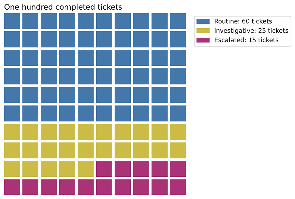
The blue region takes most of the grid, but the other categories remain countable. This works well in an explanatory report where we want someone to grasp a broad split without first decoding an axis.
The legend carries the values because counting 25 squares is a poor use of a reader’s afternoon. Colour gives the quick impression; text supplies precision. Labels also help readers who cannot reliably distinguish the colours.
For comparing ten offices, I’d usually choose bars. A waffle is comfortable with one small composition. Repeating it many times makes the reader compare areas and count fragments, which is a lot of effort for information a shared baseline would make obvious.
The grid has a resolution limit
Real counts rarely add up to a neat square. Suppose next month’s totals are 137, 58, and 26. If we still use a 100-cell grid, each cell represents approximately 1% of 221 tickets, rather than one ticket.
Rounding each share independently can produce 99 or 101 cells. We’ll allocate the whole-number parts first and give the remaining cells to the largest fractional remainders. This is a plotting decision, so it belongs in our code rather than in an unstated default.
This will result in the table:
               tickets  actual_percent  grid_cells
Routine            137           61.99          62
Investigative       58           26.24          26
Escalated           26           11.76          12
The function preserves the grid total, but it cannot preserve arbitrary precision. A category below half a percentage point may receive no cell at all, depending on the other remainders. If rare escalations are the point of the report, hiding them in a rounded grid defeats the purpose.
We can label the true counts while plotting the allocated cells:
A 100-cell waffle showing rounded proportions, with exact ticket counts in its legend.
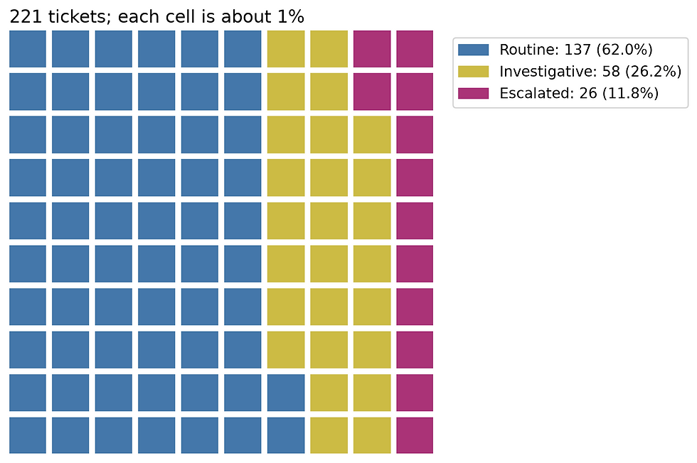
We now have a clear view of the overall mixture. We still know nothing about whether individual offices resemble it.
Not the whole block story
PyWaffle can also replace squares with icons or characters, arrange several waffle charts in one figure, and draw into an existing Matplotlib layout. If each block should represent one ticket, we can specify just the row count and let the grid grow with the data. Alternatively, rounding_rule="float" allows partially filled rectangles, preserving fractional shares without forcing them into whole cells. That option works with rectangles rather than icons. The PyWaffle examples also cover automatic value labels, sorting, and layout controls.
Three shares fit inside a triangle
A ternary plot shows three non-negative components whose sum is fixed. Each corner means 100% of one component. A point in the centre contains equal shares; a point on an edge contains none of the component at the opposite corner.
There are three labels but only two independent quantities. Once routine and investigative shares are known, the escalated share is whatever remains. That’s why the mixture fits on a flat triangle without requiring a 3D plot and an optimistic amount of mouse rotation.
For a concrete point, (0.60, 0.25, 0.15) means 60% routine, 25% investigative, and 15% escalated. The coordinates follow the axis order we choose, not alphabetical order. In mpltern, the arguments are top, left, and right.
We’ll create 45 office workloads and use a Dirichlet distribution, so that it generates positive triples that sum to one. Its parameters control the synthetic mixtures; they are a convenient data generator here, not a fitted model of office behaviour.
Office workload compositions plotted inside a ternary triangle.
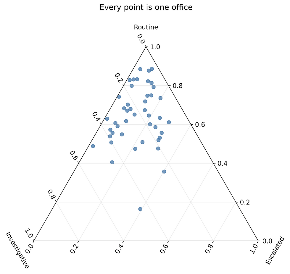
The checks prevent undefined mixtures from reaching the plot. A zero-ticket office has no observed proportions, even though a row of zeros might look like harmless input.
The points tend towards the routine corner because we generated them that way. An office nearer the investigative corner devotes a larger fraction of its work to investigations. This is relative workload, so a small office and a large office can occupy the same position.
To read a component’s value, follow its grid line parallel to the opposite edge. It takes a little practice. If the audience has never seen a ternary chart, walk through one labelled point before showing a cloud of 500.
The mpltern examples extend this coordinate system to contours and other plotting methods. For these 45 observations, individual points are enough. A smooth surface would imply information between offices that we haven’t measured.
Put workload back into the picture
Normalisation removed the totals. We can retain them in a separate table, or encode them in point area. We’ll also mark two different averages, because they answer different questions.
The average office composition gives every office equal weight. The pooled composition adds all tickets first, so a large office contributes more. Neither calculation is inherently preferable; the wording of the question decides.
Office compositions with point area proportional to ticket count and two summary markers.
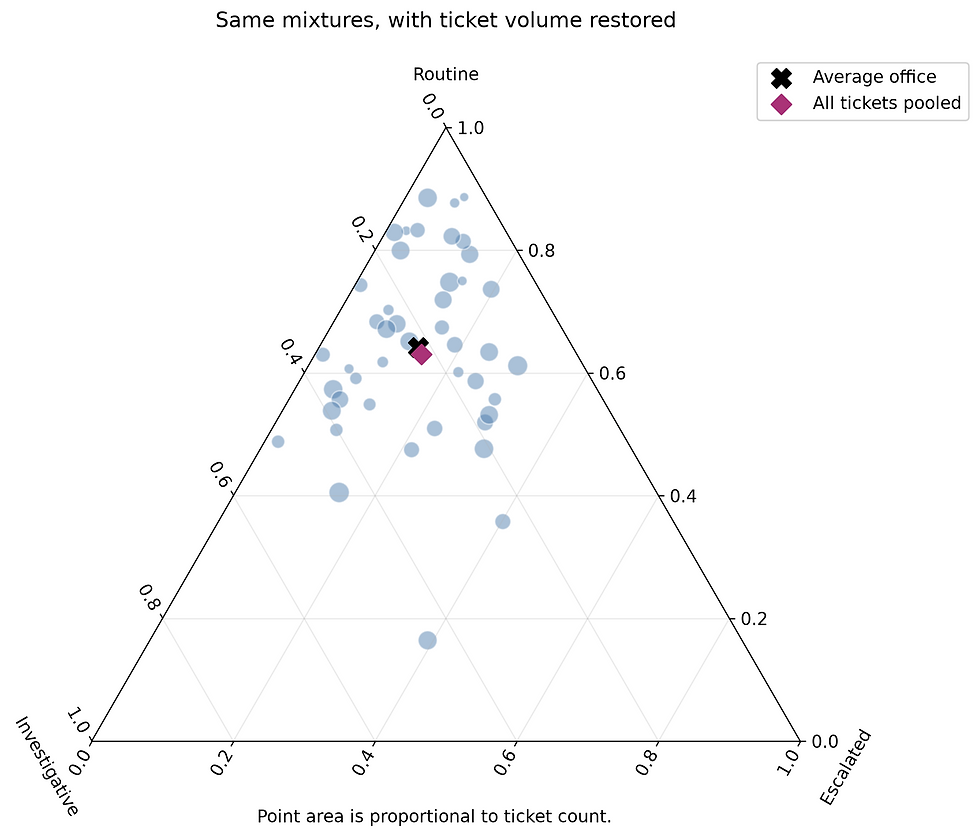
The mean office has 64.2% routine work, while the pooled tickets have 63.1%. The difference is small here, but the two numbers still describe different populations.
Matplotlib’s s argument controls marker area in points squared. Passing a quantity proportional to volume therefore gives the intended area encoding. Squaring the counts would exaggerate the difference between offices.
The two summary markers may be close in this synthetic sample. That’s a result worth accepting. We don’t need to manufacture a dramatic disagreement to justify checking the calculation.
Area is still hard to estimate precisely, and overlapping markers hide some points. For an operational report it might be better to include the count table, especially if staffing decisions depended on it. The triangle is useful for spotting unusual mixtures; it won’t tell us how many people to roster.
Beyond points in a triangle
mpltern supports more than isolated points inside a triangle. We can connect monthly observations to trace a changing composition, add arrows to show its direction, or shade a band where a component exceeds a chosen threshold. With suitable measurements or an explicit model, contours and colour-filled regions can show how another quantity varies across the composition space. It also supports polygon regions, annotations, percentage coordinates, and layouts combining ternary and ordinary Matplotlib plots. The mpltern gallery demonstrates these options.
Check the denominator before changing the palette
There are a few checks one should make before applying this to real ticket data. Each row needs a positive total. Every count must be finite and non-negative. The classification rules must be consistent across offices and across time.
A zero-ticket office has no observed composition. Replacing its undefined shares with zeros creates a triple that doesn’t belong in this triangle. Exclude it from the composition chart and report it separately as having no tickets in the period.
Missing classification needs an explicit decision too. Dropping unclassified tickets changes the denominator to classified tickets. That may be acceptable, but the caption should say so and report the excluded count. Adding a fourth category won’t fit this particular triangle. A stacked bar chart can accommodate it without a geometry discussion.
Percentages also couple the components. Routine work can lose share while its count rises, if escalations rise faster. A movement towards one corner doesn’t establish that another activity declined in absolute terms. Keep the original counts alongside the proportions whenever the distinction affects the conclusion.
For one overall split, the waffle gives a compact, approachable picture. For many three-part mixtures, the triangle preserves the relationship between all three components. If the reader needs an exact ranking, ordinary bars will often earn their place back in the report.
The useful question to ask before drawing either chart is what one square or one point stands for. Once that is clear, the plotting code is usually the easy part.
In Part II, we will switch from the composition of a workload to the distribution of individual measurements, with ridgelines and rainclouds.


Comments