Beyond bar charts, Part II: The customers hiding behind the average

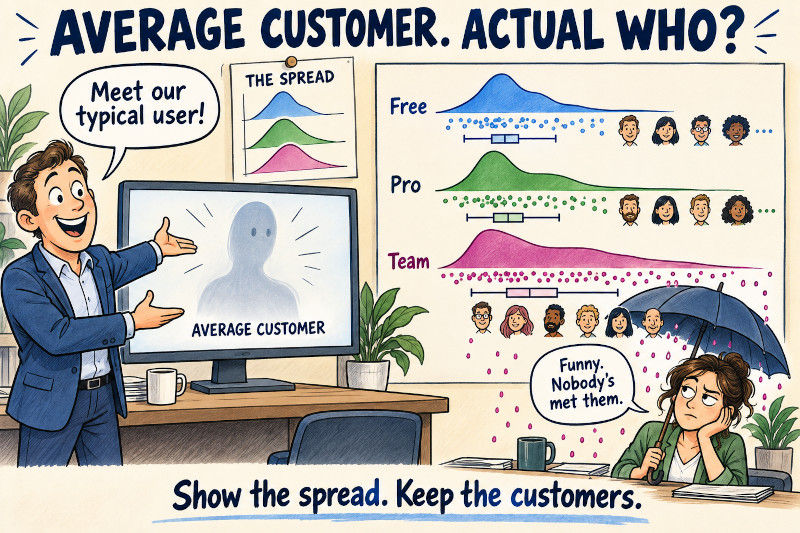
A customer dashboard can show average usage, average response time, and average satisfaction while making it surprisingly difficult to find an actual customer.
Some people use the product briefly every day. Others arrive once a month and spend two hours exporting everything. The mean lands somewhere between them, in a place neither group particularly recognises.
A smooth distribution is more informative, but it creates another problem: a convincing curve can hide a very small sample. Sometimes we need to see the observations themselves.
We will compare subscription plans with JoyPy, then use PtitPrince to put the observations back beside their distribution. Its raincloud plot combines a half violin, jittered points, and a box plot. The same synthetic customers appear throughout, so changes in appearance come from our plotting choices.
Part I covered proportions. This post is about spread, tails, and how much evidence supports the shape we see. It runs independently of the earlier examples.
Keep one row per customer
The unit of observation is a customer during a fixed 30-day window. Usage is total active minutes in that window.
This is a deliberate simplification. A session-level table would give frequent visitors more rows and therefore more influence. If the question is about customers, we should aggregate to customers before drawing the chart.
In addition to the packages JoyPy and PtitPrince, we will also need SciPy in addition to the staples from last post, NumPy, Pandas, and Matplotlib.
All Python blocks below run in order again. We generate invented records, including a broader usage distribution for the Team plan. That lets us inspect a visible difference without pretending to have discovered a real product trend.
The lognormal distribution generates positive values with a long right tail. Its centre argument is the mean on the underlying logarithmic scale, not the mean number of minutes. Raising spread changes the arithmetic mean as well as the tail, so Pro and Team aren’t an experiment that holds every statistic except variability constant.
In this sample, Pro and Team have similar medians, around 31 and 28 minutes, but their means are about 35 and 43 minutes. The larger Team mean does not establish that its typical customer is more active. Its tail needs a closer look.
Give the distribution some room
A ridgeline plot stacks several density curves vertically. Their horizontal positions share a measurement scale; their separate baselines identify groups. Partial overlap saves space while preserving the shape of each distribution.
JoyPy calculates a kernel density estimate, or KDE, using SciPy. Think of it as placing a small smooth bump around each observation and adding those bumps together. The result depends on how wide the bumps are, which we will return to shortly. The JoyPy README explains the density calculation and its returned axes if you want to know some of the details.
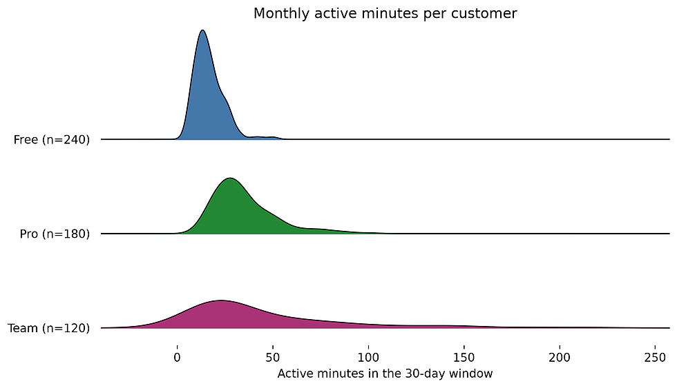
Ridgeline curves showing monthly active minutes for three subscription plans.
Note that if your Pandas version is 3.0 or later, you need to add the following before calling joypy.joyplot
The Team tail stretches the horizontal scale, squeezing the smaller values together. The plot has already told us something useful: a single shared linear axis may make the low end difficult to inspect.
The smooth curve can extend below zero even though every observed value is positive. Gaussian kernels have tails on both sides, so that extension is a smoothing artefact. It does not mean a customer used negative minutes.
The labels include sample sizes because a density curve doesn’t show group population. A group of 120 can occupy as much visual space as a group of 240. Here we want to compare distribution shapes; if we wanted to compare customer counts, these curves would be the wrong encoding.
JoyPy returns one axis for each group and an additional background axis. That’s why the common horizontal label goes on axes[-1]. Treating the returned list like an ordinary stack of independent subplots can produce surprisingly repetitive labels. As mentioned above, note the slight incompatibility with newer Pandas versions.
When the tail flattens everything else
We can compare proportional differences by plotting logarithms. The distance from 10 to 20 minutes then matches the distance from 20 to 40. This is helpful when multiplication describes the variation better than an additive change does.
Our generated observations are strictly positive, so log10 is defined. Real customer tables may contain zero usage. Decide whether inactive customers form a separate group or whether a transformation such as log1p fits the analysis; never silently drop them just to make the plot work.
The same usage data shown as ridgelines after a logarithmic transformation.
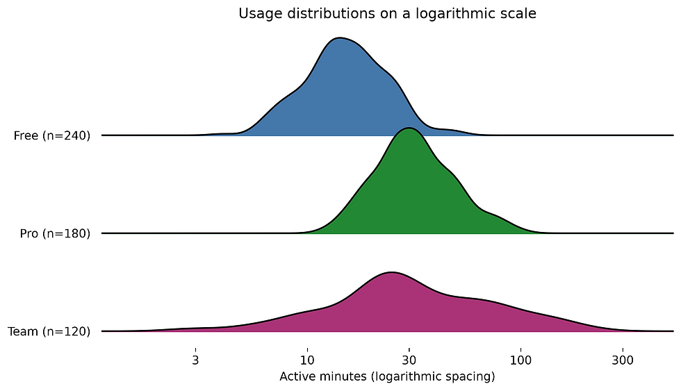
We’ve estimated densities of log minutes. This is more than changing the tick labels on the original plot: smoothing now happens in transformed space. The horizontal labels translate positions back into minutes, but the curve height is density per unit of log minutes.
That is fine for comparing shapes, provided the caption explains the transformation. It would be misleading to read the height as the number of customers who used exactly 30 minutes.
The bw_method=0.3 value controls SciPy’s KDE bandwidth factor. Smaller values can reveal local structure but also turn random variation into a row of apparently meaningful peaks. Larger values can merge genuine groups into one smooth mound. The SciPy KDE documentation describes this bandwidth behaviour.
Before telling a story about a second peak, rerun the call with 0.15 and 0.6. If the story vanishes when we change a reasonable smoothing choice, it needs more evidence. Check the underlying observations as well, particularly for small groups.
Additional information in one plot
JoyPy can also draw stacked histograms with hist=True, giving us a binned view without kernel smoothing. Passing several measurement columns alongside a grouping variable lets us overlay distributions within each row, such as this month's and last month's usage for each subscription plan. Those measurements should share meaningful units and scales. For a lighter presentation, we can switch off the fill, fade successive rows, or control how far each curve extends beyond its observations. These options are available in JoyPy's plotting interface.
Put the customers back under the curve
The ridgelines make the broader Team distribution easy to scan. They still don’t show whether a tail contains many observations or just a handful. PtitPrince’s raincloud lets us inspect that detail without abandoning the density view.
The half violin is the cloud. The dots are the rain: one point per customer, with small random offsets perpendicular to the measurement axis so coincident observations are easier to see. The box marks the middle 50% and its median. Its default whiskers extend to observations within 1.5 interquartile ranges of the box, rather than to confidence limits.
Raincloud plots of log monthly usage, with individual customers and box summaries for each plan.
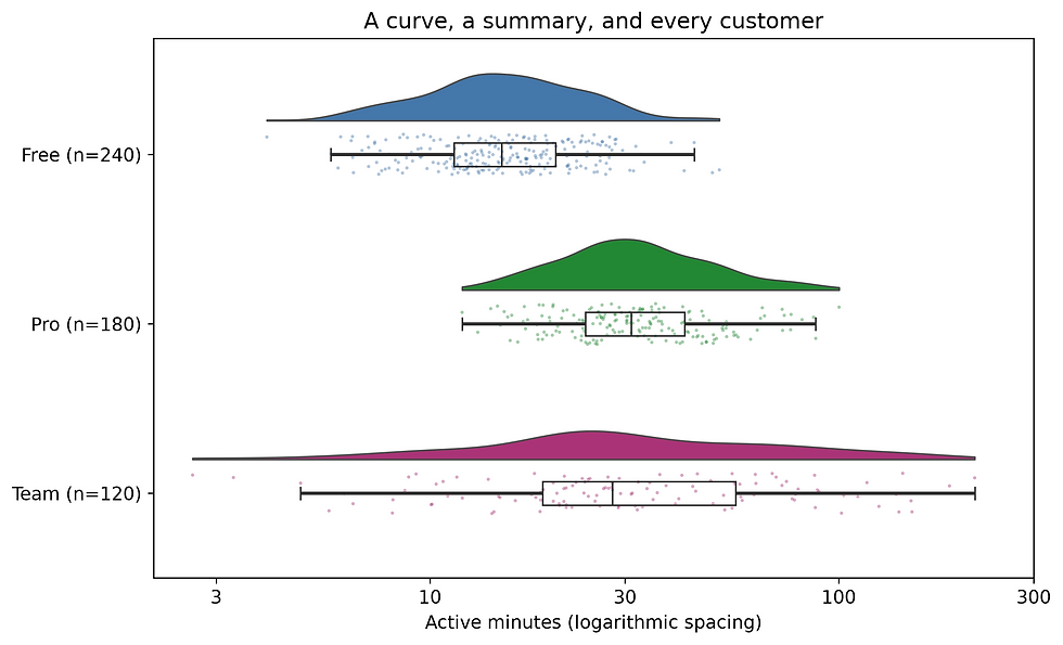
For PtitPrince’s horizontal interface, x names the category and y names the measurement; orient="h" handles the rotation. The horizontal position of every dot is still its observed log usage. Its vertical jitter has no analytical meaning.
We hide the box plot’s separate outlier symbols with box_showfliers=False because those observations already appear in the rain layer. We have not deleted outliers. That distinction matters when a chart has several representations of the same records.
cut=0 stops the displayed cloud at the observed extremes. It doesn’t correct boundary bias in the density estimate. Likewise, scale="area" normalises the cloud areas; a larger plan does not automatically get a larger cloud. Sample counts remain in the labels, while the points show where the records lie.
The PtitPrince implementation accepts component-specific options such as rain_alpha and box_showfliers. These let us reduce point clutter without fading every layer equally. This is a good point to start with before shrinking the points until they become decorative dust.
Check whether the cloud survives a different bandwidth
A second look at the same data can test whether we are reading too much into a wiggle. We can keep the points and box summary unchanged while drawing a narrow and a broad cloud.
Two raincloud panels using the same observations and jitter but different density bandwidths.
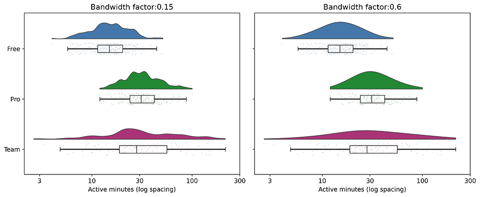
Resetting the jitter seed inside the loop keeps the dot positions consistent. That leaves the density estimate as the intended difference between panels. The bandwidth is a factor relative to each group’s spread, so the same factor need not imply an identical smoothing width in minutes.
The broad Team spread persists across these views. Small bumps need more caution. With only a few observations, a strip plot and a median marker may be more honest than fitting a cloud at all. Constant-valued groups also give a density estimator little to work with.
For a large customer base, point overlap becomes a different problem. Use transparency first. If you sample the dots, state the sample size and whether the cloud and box still use the full dataset. A sparse-looking rain layer is otherwise easy to mistake for a small population.
Some more option for the raincloud
PtitPrince can compare subgroups within each category using hue and dodge, for example separating new and returning customers within each subscription plan. It also exposes half_violinplot and stripplot separately, so we can assemble a simpler view when the full raincloud feels crowded. Setting pointplot=True adds connected group means, which can help show a pattern across ordered categories. Those lines connect summaries, though; they do not trace individual customers over time. The PtitPrince plotting functions provide these additional controls.
A useful check without smoothing
An empirical cumulative distribution function, or ECDF, shows the fraction of observations at or below each value. It needs no bandwidth. Every customer contributes an equal step within their plan.
An empirical cumulative distribution plot comparing usage across plans.
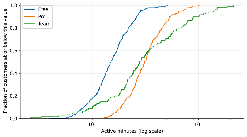
To find a median, look at where a curve reaches 0.5. To investigate a proposed threshold, inspect the fraction below that horizontal position. The ridgelines make overall shape easier to scan; the ECDF supports specific threshold questions.
Keeping this ordinary Matplotlib view beside the extension is useful discipline. A new chart type should earn the space it occupies.
A numerical threshold makes the comparison easier to act on:
In this run, 95.8% of Free customers, 45.6% of Pro customers, and 54.2% of Team customers are at or below 30 minutes. This calculates a fraction within each plan, with that plan’s customer count as its denominator. The ECDF shows the same quantity at that horizontal position. Neither a density peak nor a box’s width answers that question directly.
For real data, inspect non-finite values and missing plan labels before plotting. Keep the observation window consistent, report group sizes, and decide what zero usage means. A customer with no recorded activity may be different from a customer whose events were never collected.
These charts describe usage; they don’t demonstrate that changing someone’s plan would change their behaviour. The Team spread in our example was built into the generator. In an actual product, customer needs and self-selection could explain a plan difference.
JoyPy is a useful overview when we want to scan several distributions. PtitPrince is particularly useful when we need to see how the distribution relates to individual observations and a compact summary. The ECDF handles threshold questions without smoothing. Choose the view that makes the next question easier to answer.
In Part III, we will ask which features these customers use together, then return to rainclouds to inspect the largest membership groups. An average can stay on the dashboard; the observations deserve a place beside it.
Comments