Beyond bar charts, Part III: When your customer groups overlap

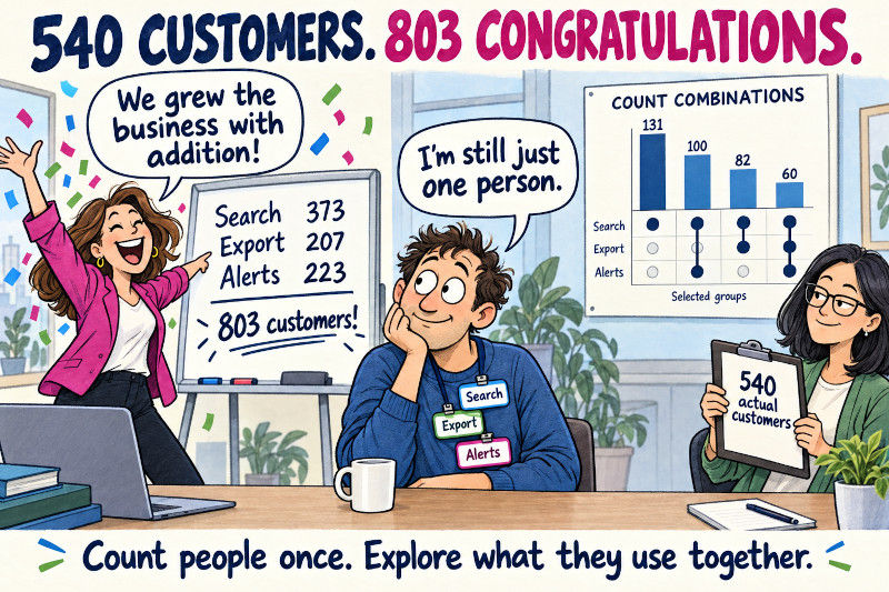
Let's assume you have 540 customers. Now the Search function on the webside records that 373 users used it, the Export function records 207, and the Alerts function another 223. Add those feature totals and you suddenly appears to have 803 customers. A happy day for marketing, but obviously problematic, since we have no clue about the overlap.
The counts answer separate questions. A person who used all three features appears in all three totals. What we need is a way to show combinations without losing track of the people behind them.
UpSetPlot combines a dot matrix of memberships with bars showing each combination’s size. We’ll use it to identify common feature groups, compare customer counts with usage volume, and inspect the largest groups with a PtitPrince raincloud. Part II introduced that distribution view; this post includes its own data setup and runs independently.
One customer, one observation window
Membership here means a customer used a feature at least once during a 30-day window. We count customers, so ten export clicks still contribute one Export member. Total active minutes measures usage across the whole product in the same window. The needed packages are as usual Numpy, Pandas, and Matplotlib, and we also throw in PtitPrice again with the new package being UpSetPlot. To note, UpSetPlot's label count fails with Numpy 2.5.3. To be save it is best to go back to NumPy 2.3.5 and Pandas 2.3.3.
The latter, makes sure that UpSetPlot does not emits pandas future warnings.
As in Part II, we use the same construction of a synthetic customer base and all the code blocks below simple run in order. The only difference will be that we add feature data for the memberships, in this case 3 boolean columns. Export is deliberately more likely among customers with more than 30 active minutes. Any relationship we find partly reflects that choice.
An unknown membership is different from False. A missing telemetry feed cannot establish that nobody used the feature. Don’t fill every missing flag with False unless the event-collection rules justify that interpretation.
Real event tables also need a customer roster. Grouping only recorded events omits everyone with no events, which changes the population before the chart begins. Build membership flags against the eligible roster, deduplicate customer-feature pairs within the window, and document any accounts excluded for incomplete tracking.
Turn an event log into membership flags
If your source has one row per click, a cross-tabulation can build the flags. This small example uses a separate three-customer roster to make the edge cases visible. Assume the event log already covers the chosen window and tracking is complete for these customers.
With our chosen random seed, customer 101’s two Search events collapse to one True membership, while customer 103 stays in the table with three False values despite having no recorded event. If nobody used Alerts during the observation window, the event table would have no Alerts column. reindex adds it back with zeros, which .gt(0) converts to False, so the membership table still includes every feature we intended to track. The roster supplies the denominator; the events supply evidence of membership.
This gives the Boolean input shape used by the main example. Join such a table to one-row-per-customer measurements by customer ID, then check the row count again. An accidental many-to-many join can inflate every combination while leaving the chart looking perfectly plausible.
Read a column from the dots upward
from_indicators constructs the Boolean membership index that UpSetPlot expects. We retain the customer measurements, then explicitly request a count of rows within each membership combination.
Customer counts for each exact feature combination, with a dot matrix showing membership.

Each column describes one exact combination. Filled dots mean membership; pale dots mean absence. A connecting line helps the eye follow the filled dots within a column, it does not add any extra information. The bar above counts customers in that combination, while the side bars show the total membership of each individual feature.
In this sample, the largest combination is Search without Export or Alerts: 131 customers. Search with Alerts but without Export contributes another 100. The Search side total is larger because it includes these groups and the other combinations containing Search.
The column with no filled dots contains 62 customers. They used none of these three tracked features, although they still have active minutes. They may have used parts of the product we didn’t include. Calling them “inactive” would go beyond the data.
By default, the package can reorder feature rows by their total size. Read the labels rather than assuming the input column order survived unchanged. You can request sort_categories_by="input" when a fixed feature order makes several figures easier to compare.
“Both” has two possible meanings
Someone asks how many customers used Search and Export. Do they mean exactly those features, or those features whether or not Alerts was also used? Both are reasonable questions, but they produce numbers.
The inclusive count is 142; the exact two-feature count is 82. The other 60 used all three. An UpSet bar represents an exclusive combination, so the inclusive answer requires adding relevant bars or returning to the Boolean columns.
Keeping those columns accessible is useful. The chart identifies a group; a Boolean mask lets us inspect or export its records. There’s no need to reconstruct customer IDs from the figure.
Count customers or add their minutes?
A large group isn’t necessarily the group contributing the most activity. We can calculate both quantities before changing the chart:
An UpSet chart weighted by total customer active minutes rather than customer counts.
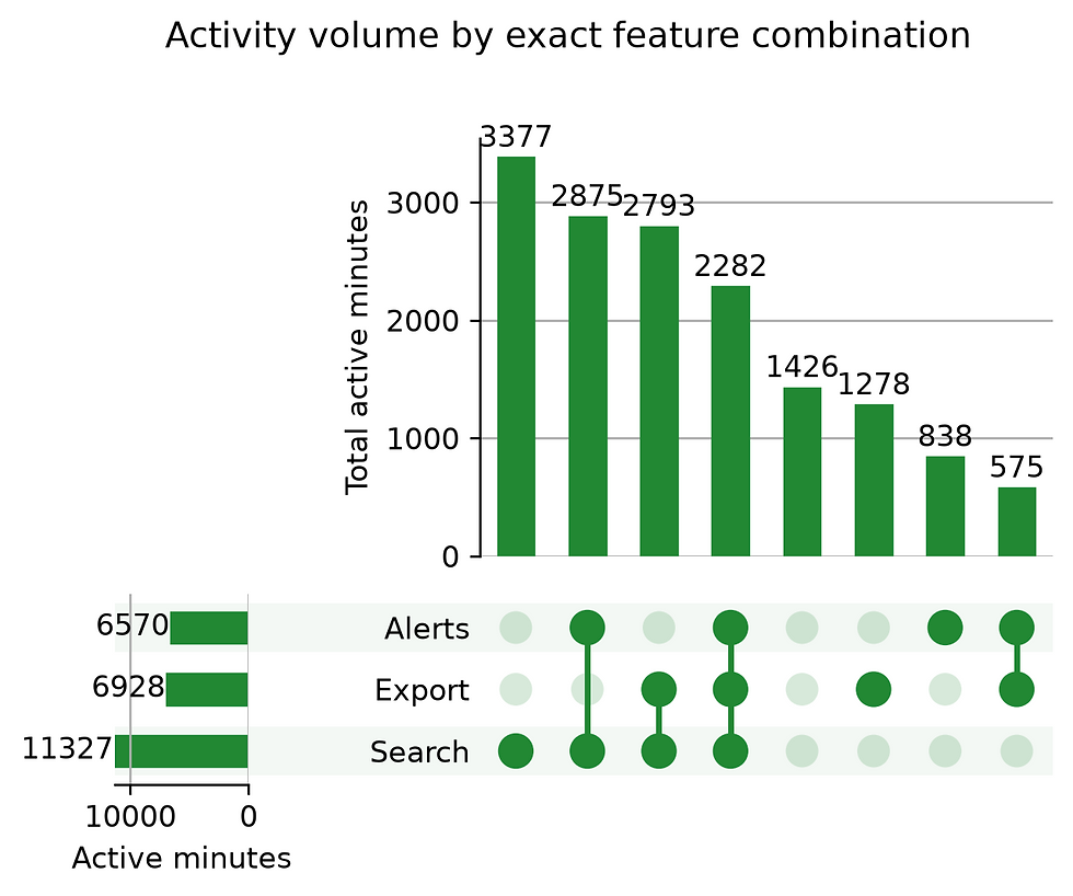
The weighted plot uses the same memberships but a different unit. Its side totals also sum minutes for customers belonging to each feature. A person’s minutes can therefore contribute to several side totals, while the exact combination bars partition the activity once.
These are whole-product minutes associated with Export users, not minutes spent exporting. Our dataset has no feature-level duration measurements. A label such as “Export time” would imply a measurement we never collected.
Sorting by size may change the order of combination columns between the two plots. Follow the dots when comparing them. If fixed positions are essential, establish a shared combination order explicitly before making a comparison figure.
Show what a filter leaves out
Three features permit eight combinations, including no membership. Eight features permit 256. At that point, an unfiltered chart can spend most of its width on groups containing very few people.
We’ll keep combinations with at least 50 customers, calculate their coverage, and highlight the exact Search-and-Export group. UpSetPlot documents these controls in its API reference.
An UpSet chart restricted to groups of at least 50 customers, with Search and Export only highlighted.
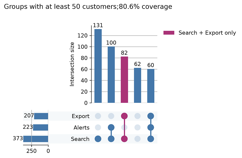
The retained combinations cover 435 of 540 customers, or 80.6%. The chart hides 105 people. UpSetPlot’s side totals still describe the full input population, so they need not equal the sum of the visible combination bars containing each feature.
This filter is reasonable for a broad usage overview. It may be a poor choice for investigating failures, where a small group can be the important one. Apply the threshold because it suits the question, and keep the full table available.
You can really go overboard with UpSetPlot very easily
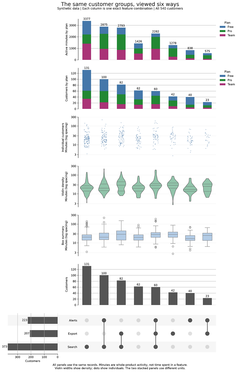
UpSetPlot can also attach additional charts directly to its membership matrix. With add_catplot, we can show a box plot, violin, or individual usage points aligned with each feature combination. add_stacked_bars can break those same groups down by subscription plan, keeping membership, activity, and plan mix together in one figure. It also accepts lists of memberships or collections of member IDs through from_memberships and from_contents, so Boolean columns aren't the only starting point. These options are described in the UpSetPlot API reference. But one should try to not go overboard with them. It is easy to stack way too much into a single plot:
Inspect the people inside the largest groups
We can now return to PtitPrince. A raincloud combines a density estimate, a box summary, and individual observations. It lets us check whether a segment’s usage total comes from broadly higher activity or a few unusually active customers.
We’ll plot the three largest exact combinations. Labels explicitly describe the selected features, and “only” means none of the other features in this tracked list.
Raincloud plots showing individual usage and distribution summaries for the three largest feature combinations.
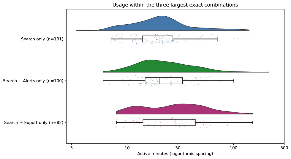
Here, order fixes the group positions, and hue_order keeps the point colours aligned with the cloud colours in the tested PtitPrince version. Both follow the same largest-first list.
All observations in those three segments appear in the rain layer. Other segments are outside this particular detail view. The density is estimated on log minutes, so horizontal spacing describes proportional differences. Dot offsets perpendicular to that axis are display jitter, not another customer measurement.
The Search-and-Export group has higher median usage than Search alone in this sample. We built Export probability partly from usage, so it would be a mistake to call that an effect of exporting. In real data, plan mix and customer needs could also explain a difference.
Before proposing a product change, inspect the plan composition and retain the source records:
The cross-tabulation reports proportions within each segment. It is a first check for a changing plan mix, not a statistical adjustment for it. The exports preserve customer IDs, original minutes, and the Boolean memberships so the next investigation can start with records rather than pixels.
We now have a complete path from customer rows to exact combinations, weighted totals, and individual distributions. The useful result is a set of specific groups we can inspect. Whether using a feature changes behaviour remains a separate question for a stronger study.
Part IV turns to chord diagrams and radial profiles, where units and denominators become just as easy to lose inside a more elaborate layout.
Comments