XY: The Python Plot That Does Not Stop at the Notebook, Part I

Updated: Aug 5
There is a familiar point in a Python project where a perfectly good Matplotlib chart starts getting asked to do a very different job.
It usually starts in a script or notebook. After a first check, somebody wants to zoom into it, then it needs a tooltip. Finally, it needs to sit inside a web application, react to a selection, and remain usable when the dataset no longer fits comfortably into a browser.
Matplotlib has not suddenly become a bad library. It is still one of the best tools for scientific figures and precise static output. The problem is that we have quietly changed the assignment.
XY is an alpha-stage Python charting library from the Reflex team. It is built for interactive browser charts, notebooks, static exports, and very large datasets. It also has a surprisingly considerate migration path for Matplotlib users.
This first part looks at XY itself: how to make charts, what it does differently, and which of its features are genuinely interesting rather than merely another spelling of plot().

The smallest useful chart
Install XY as usual via pip.
We start with a very simple line chart. It needs a mark and a container:
Running this as a script will not show much. But as a notebook, the chart as the last expression displays it. The object can also travel elsewhere using any of the following.
chart.to_html("weekly-signups.html")
chart.to_png("weekly-signups.png")
chart.to_svg("weekly-signups.svg")
This is one of XY’s starting ideas. The interactive chart and the exported chart start from the same definition. We are not creating a notebook figure, rebuilding it in a JavaScript library for an app, and then inventing a third version for a report.
A friendlier route for Matplotlib users
XY also provides a pyplot compatibility layer. A common Matplotlib example changes one import
Underneath, this is still an XY chart. It uses XY’s Rust compute layer, binary transport, and browser renderer, but keeps the calling conventions many Python users already know.
There is an important qualification here. XY describes this as full coverage of Matplotlib’s 2-D plotting-method inventory, not a reproduction of Matplotlib’s renderer, transform system, or complete Artist model. Some options are exact, some have equivalent behaviour, and some are visual approximations. Unsupported cases are meant to fail clearly rather than quietly produce a misleading result. The project’s compatibility guide records the details.
So the compatibility layer is a useful bridge, but the declarative API is where XY’s own design becomes clearer.
Charts are composed from parts
In XY, a line, axis, legend, tooltip, annotation, and theme are components placed inside a chart. That makes layering feel fairly natural:
Note that we just add components to the chart, there is no clear order, so changing the arguments to
will not change anything. Both produce the same chart

XY includes the expected line, area, scatter, bar, histogram, box and violin plots. It also has heatmaps, hexbins, contours, ECDFs, uncertainty bands, segments, triangle meshes, polar plots, facets, annotations, linked charts, and interaction controls. The chart gallery is worth browsing because the interesting part is not merely the number of chart families. It is that the same marks can be layered and used in a live application.
DataFrames stay DataFrames
Real charts rarely begin with two tidy lists typed directly into the plotting call. Much more likely, they begin with a CSV, a query, or a DataFrame that has already survived some amount of cleaning.
XY accepts a Pandas DataFrame through data= and lets marks refer to columns by name:
XY deliberately does not try to become a DataFrame engine. Sorting, grouping, joins, missing-value rules, and business calculations should happen before the chart is built. I like this boundary because visualisation libraries can become rather mysterious when they silently reshape a table on our behalf.
Mappings of aligned columns work too, as do supported Arrow arrays. Polars users currently need to extract columns as NumPy arrays or convert to Pandas because XY does not yet document a dedicated Polars contract. That is the sort of alpha limitation worth discovering before adopting it halfway through a dashboard.
Styling belongs to the application too
Matplotlib gives deep control over a figure, but it does not naturally inherit the design system of a web application. XY can be styled through Python properties and themes, while its browser-facing parts can use CSS or Tailwind classes.
This example uses styles to change the modify the tooltip as well as the background, into a rounded white background with a shadow.
This way, tooltips, controls, legends, labels, and containers can look like the rest of the interface, if it is embedded into a website or html styled report. Mark colours and geometry still live in XY’s typed chart properties, which also gives static exporters something concrete to work with.
There is one practical catch: Tailwind class names can appear in standalone HTML, but the compiled Tailwind rules are not automatically bundled with the export. Essential colours should stay in chart properties or theme tokens when the file has to work on its own.
The browser does not need every point
The feature that most separates XY from a normal Matplotlib workflow is its large-data architecture.
Many web-chart pipelines serialize every numeric value to JSON and ask the browser to draw every mark. XY keeps the exact columns in a figure-owned store, performs data-heavy work in Rust, and sends typed binary buffers to the browser. Small traces can remain exact, i.e every point is transmitted. Long lines can use M4 reduction, i.e from a bucket of nearby points only the first, last, minimum and maximum are kept. Finally, large scatter plots can become density grids, i.e. the amount of points falling grid cells determines the darkness/transparency of a cell.
The distinction is important: the original values remain available even when the screen receives a reduced representation. When the user zooms into a smaller range in a live notebook or Reflex app, XY can request a refined view. It does not pretend that a density cell is an individual observation.
Here is the basic pattern for a million-point cloud:
Running this in a notebook, displays the chart widget. Her density=None lets XY choose the representation, density=True requests a density overview and density=False forces direct points. The current defaults start line decimation above 10,000 rows and automatic scatter density above 200,000 points, but these are alpha-stage policy thresholds rather than promises to hard-code into an application.
The repository publishes a particularly bold benchmark. In its recorded test on an Apple M5 Pro, XY’s density path stayed around 0.07 to 0.09 seconds from 10,000 through 100 million points. Matplotlib WebAgg reached 13.385 seconds at 50 million and did not complete the following zoom at 100 million. Those are the project’s own results, with a specific browser harness and a reduced density representation. They are interesting, but they are not proof that every XY chart beats every Matplotlib chart. The benchmark runbook matters as much as the headline number.
XY still has to ingest and inspect the source data. The clever part is that source size does not force an equally large browser payload or one visible marker per row.
There is also a practical diagnostic for this, chart.memory_report() exposes the retained canonical bytes, column lengths, and ingest copies. That may sound like an obscure feature until one dashboard contains twenty charts and each one quietly keeps its own copy of a large time column. It gives us somewhere concrete to look before blaming the browser or buying more memory.
Interaction is part of the chart definition
Pan, zoom, hover, crosshairs, box zoom, and selection are first-class chart concerns:
In this case, using shift + click one can drag a box around a selection of the plot and zoom in.
Matplotlib does have interactive backends, event handling, widgets, and WebAgg. The difference is not that interaction is impossible there. XY is designed around browser interaction and application integration from the start. Its renderer uses WebGL2 for marks, Canvas for axes and grid lines, and DOM elements for labels, tooltips, and controls.
That architecture allows a selection to become more than a rectangle painted over an image. In a live host it can resolve back to canonical source rows and feed application logic. We will use exactly that in Part II later.
It is not only about the number of points
The performance story is the easiest part of XY to demonstrate, but it may not be the most useful difference in an everyday project. Most charts do not contain a hundred million observations. Plenty of them still need to behave like part of an application.
This is where saying that Matplotlib “cannot” do something becomes a little slippery. Matplotlib has interactive backends, callbacks, widgets, animations, and WebAgg. With enough supporting code, it can participate in a web application. What it does not provide on its own is XY’s application model.
An XY chart can be a responsive component whose width follows its container. Its tooltips and controls can use the same CSS as the rest of the page. Independent charts can join a link_group, allowing a pan or zoom in one view to update the others directly in the browser. In an example for a notebook this would look as follows.
Which would generate a chart of the following form.
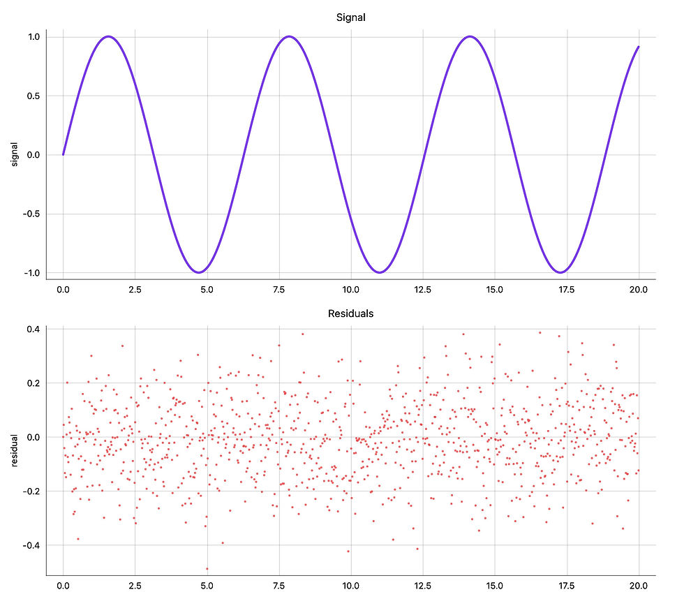
But the important piece is that the chart can be interactively zoomed in along the x-axis as well as panned, and both operations are synced in both charts.
In a live Reflex application, a click can return the underlying source row to a normal Python event handler rather than merely reporting a mouse position on a canvas.
Those differences become especially visible in a dashboard. Imagine an overview time series, a residual plot, and a table of unusual measurements. With XY, the two charts can synchronize their x-axes locally. Clicking a residual can send its canonical row to Reflex state, which can then populate the table or a detail card. The immediate navigation stays in the browser, while the application-level decision returns to Python.
Streaming follows the same idea. XY can append new points to a registered live figure without reconstructing the whole component. Matplotlib can update an Artist in an animation loop, but serving that update to several browser sessions and connecting it to per-user state is application infrastructure we would have to supply ourselves.
So the more precise comparison is this: Matplotlib is primarily a figure-rendering system with interactive backends. XY is an interactive web-chart system that can also produce static figures. Large-data reduction is one consequence of that design, but responsive layout, CSS styling, linked views, semantic row events, and live application state all come from the same decision.
Where XY is not the answer
XY is currently at version 0.0.1 and explicitly labelled alpha. APIs and callback payloads may move. The roadmap still lists several chart families and 3-D or volume plots as future work. Matplotlib also has decades of examples, integrations, projection support, and fine-grained publication control behind it.
For a carefully typeset scientific paper, an established Matplotlib pipeline remains a very comfortable choice. For a chart that needs to become an interactive application component, especially with a large dataset, XY is tackling a different and useful problem.
The most appealing part is the continuity. We can begin with familiar plotting syntax, switch to composable chart parts when needed, keep interactivity in the browser, and export the same chart object. In Part II we will place XY inside a Reflex app, connect it to state, and make the chart send useful events back to Python.

Comments