XY: From Plot to Reflex Application, Part II

In Part I we made the case that XY is more than a faster way to spell a Matplotlib chart. Its real advantage appears when the plot becomes part of an application.
This is where Reflex enters the story. Reflex lets us build a web application in Python, including its layout, state, and event handlers. The reflex_xy adapter turns an XY chart into a normal Reflex component. It does not place an iframe in the page or ask us to maintain a separate JavaScript chart service.
The result is a useful division of work. Reflex owns the application and session state. XY owns chart data, rendering, and interaction mathematics.

Install the integration
To install XY with its Reflex extra, we need to add xy[reflex]. The project is still alpha, so pinning a known working version is sensible for a real application.
XY’s adapter must also be registered in rxconfig.py:
The plugin uses the Reflex application’s existing Socket.IO connection for XY’s binary data. We do not have to deploy another web service or websocket endpoint. Depending on your version of Reflex, this config file might look very different. Also remember that the code for the app needs to go into an appropriate subfolder as usual for Reflex.
The easy case: a fixed chart
When the data does not depend on application state, create an ordinary XY chart and pass it directly to reflex_xy.chart:
Start this by running Reflex via
reflex runThen XY compiles this fixed chart into a content-addressed binary asset during the frontend build. Hover, pan, zoom, and density refinement can still happen locally in the browser. Since there is no live Python chart behind it, it cannot dispatch semantic events to backend handlers.
This fixed tier is a good fit for documentation, public dashboards, or any chart whose data changes only when the application is rebuilt.
A chart driven by Reflex state
The more interesting case is session-specific data. XY provides the @reflex_xy.figure decorator for a chart computed from Reflex state.
The following example changes the number of generated points and displays the coordinates of the point under the cursor:
This will produce a page that in the browser looks roughly as follows.
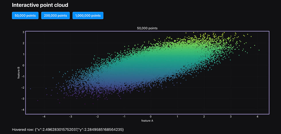
The decorator behaves like a computed state value, but it does not push a million coordinates through normal Reflex JSON state. Reflex stores an opaque token while XY sends numeric columns as binary frames over the application’s websocket.
That is a much more suitable boundary for charts. The application reacts to a small event dictionary; the heavy numeric arrays stay in the chart data plane.
It is also worth noticing what happens when one of the buttons changes points. The figure method reads self.points, so Reflex recomputes the chart for that session. A second user does not inherit the first user’s choice. This is ordinary Reflex state behaviour, but it is exactly what turns a chart demo into an application rather than a globally shared picture.
The figure builder may also be asynchronous. That means it can await an application data source using the same rules as an asynchronous Reflex computed value. The chart should still receive finished columns rather than become responsible for database work, but the data does not have to be available at module import time.
Chart events are application events
The adapter exposes semantic events on the outer reflex_xy.chart(...) component:
on_point_hover receives the resolved row under the pointer.
on_point_click receives a point event with its data and canonical row identity.
on_select_end receives a JSON-safe selection summary.
on_view_change receives the current view after pan or zoom.
Animation start and end events can also call Reflex handlers.
There is a small naming trap. Core XY callbacks such as on_hover and on_select belong to charts used in a notebook. In a Reflex app, backend event handlers belong on reflex_xy.chart and use names such as on_point_hover and on_select_end.
Once events reach Reflex state, ordinary interface components can react. A click can populate a detail card. A box selection can filter a table or rebuild a histogram. A view change in an overview chart can update a second chart with a more detailed calculation.
This is a feature Matplotlib can approximate through callbacks and a suitable interactive backend, but it is not Matplotlib’s usual application model. Here the chart is already a component in the same reactive tree as the buttons, text, forms, and tables around it.
That distinction is more useful than a claim that Matplotlib simply cannot react to a click. It can, but you have to add the functionality by hand most of the time. The extra value here is that XY resolves chart interaction into application data and Reflex already knows what to do with the resulting event. We do not have to translate browser coordinates, locate a corresponding record, and build a separate bridge into the page’s state system.
Cross-filtering two charts
Suppose a scatter plot shows transactions by value and risk score. A histogram beside it shows the distribution of transaction values.
We want the histogram to change when the user selects an area of the scatter plot. The complete flow looks like this:
User selects points in scatter plot
                ↓
XY sends selection bounds to Reflex
                ↓
Event handler stores x0 and x1 in state
                ↓
State-backed histogram is recomputed
                ↓
Histogram displays values inside that range
First, create some example data:
The application state stores the selected horizontal range:
Here, use_selection does not redraw either chart itself. It only updates the Reflex state. That is an important distinction: event handlers describe what changed, while state-backed figure methods describe what the interface should look like after the change.
We also need an event that clears the selection again.
The scatter plot is declared as an XY figure:
The histogram is another state-backed figure. It reads the selection variables and filters the data when a selection is active:
We place everything inside a consistent format.
Finally, the Reflex page connects the scatter plot’s selection event to the handler:
This line performs the important connection:
on_select_end=Analysis.use_selectionAfter adding the usual app start lines.
When the user finishes dragging a selection across the scatter plot, XY sends a compact selection event to Reflex. The event contains information such as the selected data bounds and total number of selected points.
The event use_selection copies the horizontal bounds into x0 and x1 and sets selection_active to True.
The histogram figure knows all three variables:
self.x0
self.x1
self.selection_active
Reflex therefore knows that the histogram depends on them. When the event handler changes those values, Reflex asks value_histogram for a new XY chart. The filtered numeric data then travels through XY’s binary chart connection, while the selection event itself remains a small JSON-safe message.
The scatter plot does not need to be rebuilt merely because its selection changed and Reflex can see in the code that it does not depend on any of the variables that change with the selection. The histogram changes because it depends on the selection state.
If the user clears the selection, selection_active becomes False. Reflex recomputes the histogram again, this time using every transaction value. The result looks something like this.
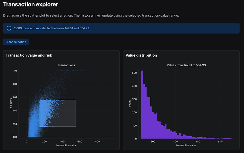
Each browser session has its own Analysis state. One user selecting expensive transactions does not change the histogram shown to another user.
Streaming without rebuilding everything
XY also supports appending points to a registered live figure:
By token we mean a registered XY chart, and x and y are the new observations that should be added. This can be called from an event or background task. It is a better match for sensor readings, job progress, or market ticks than repeatedly reconstructing an entire chart component for one new observation.
Stable mark keys and xy.animation(match="key") can preserve visual identity when a state-driven payload does need to change. In other words, updates can look like updates rather than a fresh chart flashing into existence.
Three data tiers, not one
The integration has three useful modes:
Source | Best use | Live backend events |
reflex_xy.chart(chart) | Fixed, exportable chart | No |
reflex_xy.inline(chart) | Fixed data with live kernel round trips | Yes |
@reflex_xy.figure | Per-session, state-driven chart | Yes |
The name inline() is slightly misleading. It should run at module scope and creates a kernel-backed token for fixed data. Passing a chart object directly is the genuinely static tier.
Choosing the simplest tier is worthwhile. A fixed chart does not need a backend connection merely because it can zoom, but a per-user filtered chart does.
This choice also affects deployment. A direct fixed chart can survive reflex export without a running backend because its payload becomes a build asset. An inline() token or state-backed figure needs the live XY registry and websocket path. If a chart works during local development but loses backend events after deployment, the first question should be whether the chosen tier matches the hosting model.
Browser-local behaviour and Python-backed behaviour can coexist. Pan and zoom should feel immediate because the browser handles the gesture first. Python only needs to come in when the application requires exact rows, a freshly refined view, or a state change elsewhere on the page.
What becomes possible
The combination of XY and Reflex closes a gap that appears in many Python projects. We can keep data preparation and application behaviour in Python while gaining browser-native interaction, responsive layout, CSS styling, and a renderer designed for data beyond the one-marker-per-row limit.
That makes several patterns much easier:
A quality-control dashboard where selecting an outlier opens the original record.
A large time-series overview linked to a detailed view of the visible window.
A live experiment monitor that appends measurements from a background task.
A data explorer where controls alter bins, filters, colours, and chart type for each session.
There are still alpha edges. The adapter and its payload details are experimental, custom framework objects stored as legend or tooltip chrome are not mounted by the shipped adapter, and production applications should pin XY. It is also worth testing static exports separately from the live browser view when exact renderer parity matters.
But the overall direction is compelling. Matplotlib gives Python an exceptional figure-making toolkit. XY and Reflex address the moment when that figure has to become a responsive, stateful piece of software.

Comments