When Geography Lies: Measuring Australia’s Population Imbalance with popgrid

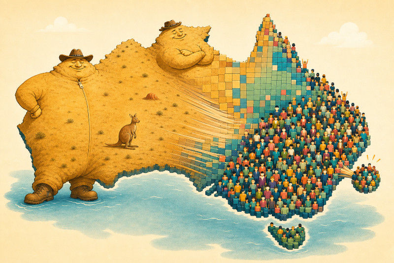
A standard map of Australia gives Western Australia a lot of visual authority. That is geographically deserved, but demographically is quite a bit off.
Ordinary maps allocate space according to land. This is normally useful and correct because land is where borders, roads, rivers, and awkwardly placed labels live. It becomes less helpful when the question is about people. A state can dominate the page while containing only a modest share of the population, while a compact urban territory becomes a nearly invisible footnote.
The popgrid repository approaches this problem with block cartograms. Instead of allowing every square kilometre to demand equal attention, it turns a country into a tiled grid where each block represents an equal share of land or population.
This post uses that idea for an Australian data-analysis project. We will create land-area and population cartograms, calculate a simple measure of how strongly each state or territory differs from the national pattern, and decide whether popgrid belongs in a data-science workflow or merely produces attractive maps.
It does not attempt to predict population growth, explain migration, or produce a live demographic dashboard. One map can be asked many questions, but it should not be asked to invent a time series.
A Map Can Be Accurate and Still Emphasise the Wrong Thing
A conventional map answers a geometric question:
Where is each region, and how much physical space does it occupy?
A population cartogram answers a different question:
How much of the selected quantity belongs to each region?
Those questions are related, but they are not interchangeable. A choropleth map normally preserves each region’s geographic shape and uses colour to encode a value. That works well for rates such as unemployment, rainfall, or election share. The reader can compare colours while the map continues to look like the country.
A block cartogram, on the other hand, changes the geometry itself.
In popgrid, the target country is divided into roughly 1,000 blocks by default. On an area map, one block represents roughly 0.1% of the national land area. On a population map, one block represents roughly 0.1% of the national population.
The block therefore stops behaving like a location and starts behaving like a unit of quantity.
That distinction matters. A reader should not inspect one square and ask what happened at that exact coordinate. The square represents part of a regional total, not a tiny census collector who has been assigned a postcode.
What popgrid Actually Does
The smallest example is pleasingly small:
Here AreaGrid weights regions by physical area, while PopGrid weights them by population.
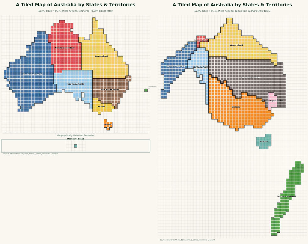
If you run this code, you will see a problem that is the reason for the big green landmass on the lower right. There is no population data for Macquarie island. So the package falls back onto a default value, which is quite large. There are two options to get around this.
The first is the sledgehammer, inside the plot() method of the grid we add
scope="mainland"This will drop all parts not connected to the mainland in this case and results in the following.
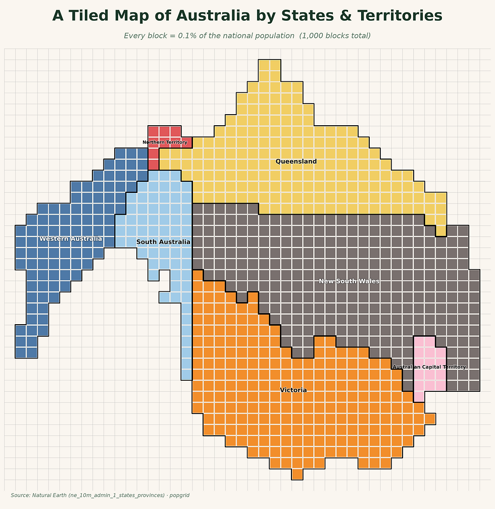
Which looks better, but now even Tasmania is missing. Even though most Australians probably would not mind, this is not exactly what we want.
Alternatively we can assemble the data by hand. This results in the following plot.
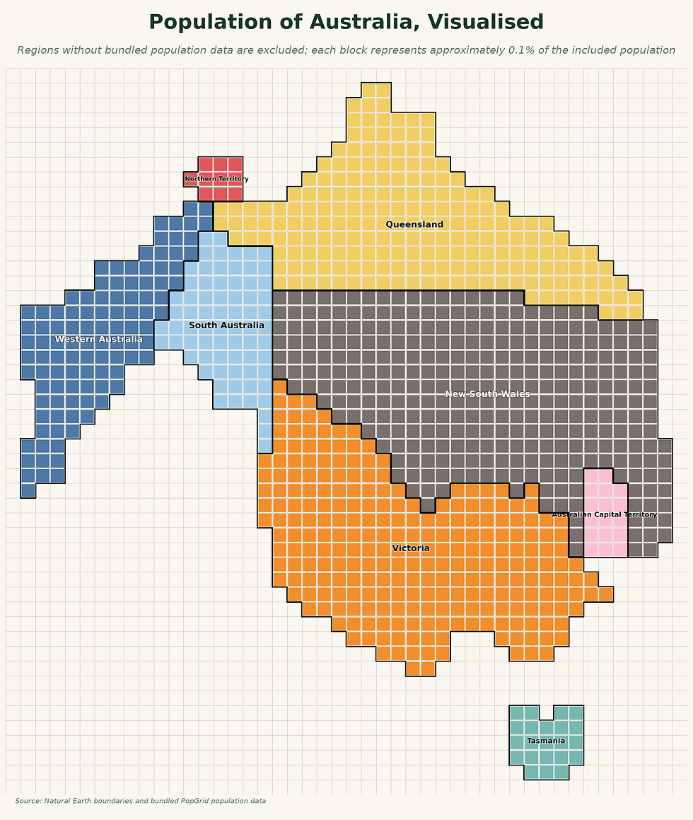
In contrast to the previous simple version, here we have to first read the precise population data, record the ones that have actual population data given and reduce the regions to those that we have data on. This looks as follow, but is rather lengthy. We will come back to some of the parts used here later on.
The package supports 24 bundled countries, including Australia, and it can also accept a custom GeoDataFrame. The first country-based run downloads Natural Earth administrative boundaries and caches them locally. Population data for the supported countries ships with the package.
The public API is simple, but the machinery underneath it is not merely a rectangular plotting loop.
The repository describes a four-stage process:
project the administrative regions into an equal-area coordinate reference system;
assign an integer block quota to each region using the Hamilton largest-remainder method;
deform population maps with a contiguous-area cartogram before rasterising them;
fit the cells to the quotas and reuse stable colours based on regional adjacency.
The useful result is consistency. A state keeps the same colour between the land and population versions, while its number of blocks changes.
The map is therefore designed for comparison rather than decorative cartographic drama. It may still look dramatic.
Turning the Repository into a Data-Analysis Question
A visual comparison already tells us something. New South Wales and Victoria should expand under population weighting. Western Australia and the Northern Territory should contract.
We can make that observation more precise. The project question is:
Which Australian states and territories contain a larger or smaller share of the population than their share of the land?
The analysis uses two inputs:
popgrid's bundled 2021 ABS population snapshot
                         +
Geoscience Australia state and territory land areas
                         ↓
population share and land share
                         ↓
log-ratio population-pressure score
                         ↓
ranked table and figures
The eight principal states and territories are included. Jervis Bay Territory, Lord Howe Island, and Macquarie Island are excluded from the numerical comparison so that the population table aligns cleanly with the state-and-territory area table.
This is a project choice, not a law of cartography. A study focused on external territories should define a different comparison set.
Reading the Population Data Bundled with the Package
The repository stores its population snapshot inside the installed Python package. We can access it without hard-coding the location of the virtual environment:
The Australian rows contain:
iso3 | region_name | population | year | sourceFor the bundled data, the Australian values are from the 2021 ABS Census.
That date needs to stay attached to the result. The package documentation explicitly describes the bundled figures as a fixed snapshot rather than live population data. This is good for reproducibility, but it means the output should not be presented as a current estimate merely because the script ran today.
A map can be freshly rendered from old data. Matplotlib does not check the census calendar.
Adding Land Area
Geoscience Australia publishes total land areas for the states and territories. For this small project, a configuration dictionary is sufficient:
We then select the matching population rows and attach the area values:
Which gives us a nice table with the needed information, combining population and size of the 8 major states and territories.
Comparing those columns directly would be awkward. The numbers use different units and very different scales. What we need is each region’s share of the national total.
Now both columns answer the same form of question:
What fraction of the selected Australian total belongs to this region?
That makes the comparison meaningful.
     				 region_name  population_share  area_share
224  Australian Capital Territory             1.69%       0.03%
228               New South Wales            31.68%      10.42%
229            Northern Territory             0.98%      17.53%
230                    Queensland            20.35%      22.50%
231               South Australia             7.14%      12.80%
232                      Tasmania             2.19%       0.89%
233                      Victoria            25.52%       2.96%
234             Western Australia            10.44%      32.87%
New South Wales contains about 31.7% of the selected population but 10.5% of the land. Victoria contains about 25.5% of the population but only 3.0% of the land.
Western Australia moves in the other direction: roughly 33.0% of the land and 10.4% of the population. The Northern Territory contains about 17.6% of the land but less than 1% of the population.
The cartograms made this visible, while the table lets us measure it.
Defining a Population-Pressure Score
A simple ratio is enough to express the mismatch:
A ratio above 1 means that a region’s population share exceeds its land share. A ratio below 1 means that its land share exceeds its population share.
The raw ratio has one inconvenient feature. Values above one can grow without limit, while values below one are compressed between zero and one. A region with twice the expected population receives 2, but one with half receives 0.5. The relationship is reciprocal, but the scale does not look balanced.
A base-two logarithm fixes that:
The score is:
population pressure = log₂(population share ÷ land-area share)Its interpretation is deliberately simple:
0 means population share and land share are equal;
+1 means twice as much population share as land share;
+2 means four times as much;
-1 means half as much population share as land share;
-2 means one quarter as much.
The score is closely related to population density. In fact, it expresses each region’s density relative to the combined national density, then places that comparison on a symmetric logarithmic scale.
Calling it population pressure is a project label. It does not measure housing stress, congestion, environmental pressure, infrastructure demand, or quality of life. Those would require additional data.
What the Score Shows
The resulting ranking is:
Region | Population share | Land share | Pressure score |
Australian Capital Territory | 1.69% | 0.03% | 5.79 |
Victoria | 25.52% | 2.96% | 3.11 |
New South Wales | 31.68% | 10.45% | 1.60 |
Tasmania | 2.19% | 0.89% | 1.30 |
Queensland | 20.35% | 22.57% | -0.14 |
South Australia | 7.14% | 12.84% | -0.84 |
Western Australia | 10.44% | 32.98% | -1.65 |
Northern Territory | 0.98% | 17.59% | -4.16 |
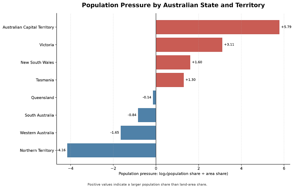
The Australian Capital Territory is the extreme positive case. Its population share is roughly 55 times its land share, giving a score near 5.79. Victoria follows with a ratio of about 8.6 and a score just above 3. Queensland sits close to zero. Its population and land shares are not equal, but they are much closer than those of the other large states.
The Northern Territory occupies the strongest negative position. Its population share is only about 5.6% of its land share, corresponding to a score near -4.16.
This does not mean that the Northern Territory is “underperforming” or that the ACT is “overcrowded”. The score only describes the selected quantities at the state level.
It is an imbalance measure, not a judgement. Expressed in a bar chart we get the following.
Where popgrid Adds Something the Bar Chart Does Not
At this point, a reasonable objection appears. We calculated the result with Pandas and displayed it with Matplotlib. Did we really need popgrid? For the arithmetic, no. For the spatial explanation, yes.
The bar chart ranks abstract categories. It clearly shows that two shares differ, but it removes the regions from their geographic relationship.
The cartogram keeps a distorted form of adjacency and relative position. Victoria still sits in the south-east. Western Australia remains west. Neighbouring regions remain recognisably connected even while their sizes change.
That makes the two views complementary:
View | Best at showing | Main weakness |
Conventional map | location, shape, adjacency | large regions dominate visual attention |
popgrid cartogram | regional share while retaining spatial structure | cells are not exact locations |
Bar chart | precise ranking and magnitude | geography disappears |
Pressure score | symmetric quantitative comparison | compresses the story into one derived number |
The repository is most useful when the cartogram is treated as one stage in an analysis rather than as the final answer. A map starts the question, then a table checks it, and finally a metric lets us compare it.
Is This Data Analysis or Data Science?
It is clearly data analysis. We combine spatial boundaries, population values, and official land areas. We transform them into comparable shares, define a derived feature, rank regions, and create visual explanations. That is a complete exploratory workflow.
Whether it deserves the broader label data science depends on what happens next.
The repository does not provide a modelling target, historical panel, or large feature matrix by itself. It is not a machine-learning dataset wearing a colourful grid costume.
It can, however, become part of a data-science project.
Comparing Countries
The package includes population data and recommended regional segmentation for 24 countries. We could repeat the analysis for each country and derive national features such as:
maximum absolute population-pressure score;
variation in the regional scores;
share of the population contained in the largest region;
Herfindahl–Hirschman concentration of regional population;
divergence between the area-share and population-share distributions.
Those features could support clustering or dimensionality reduction.
The question would no longer be “Which state expands?” It would become “Which countries have similar internal patterns of population concentration?”
Adding Time
The bundled values are snapshots. Replacing them with historical census data would create a panel:
country | region | year | population | area | pressure scoreWe could then analyse whether national settlement patterns are becoming more concentrated or more dispersed.
That would support trend analysis, change-point detection, or forecasting. The time series would come from the external population source, not from popgrid itself.
Connecting Other Variables
Population pressure could also be joined with:
housing costs;
transport access;
night-time lights;
employment;
service availability;
emissions;
disaster exposure;
infrastructure investment.
At that point, the cartogram becomes an explanatory view for a richer model.
The important order is:
define the question
        ↓
assemble trustworthy variables
        ↓
analyse and model
        ↓
use the cartogram to communicate the spatial pattern
Reversing that order risks building a model because the map looked interesting. This is a surprisingly common research design, especially when the map has nice colours.
Using Your Own Data
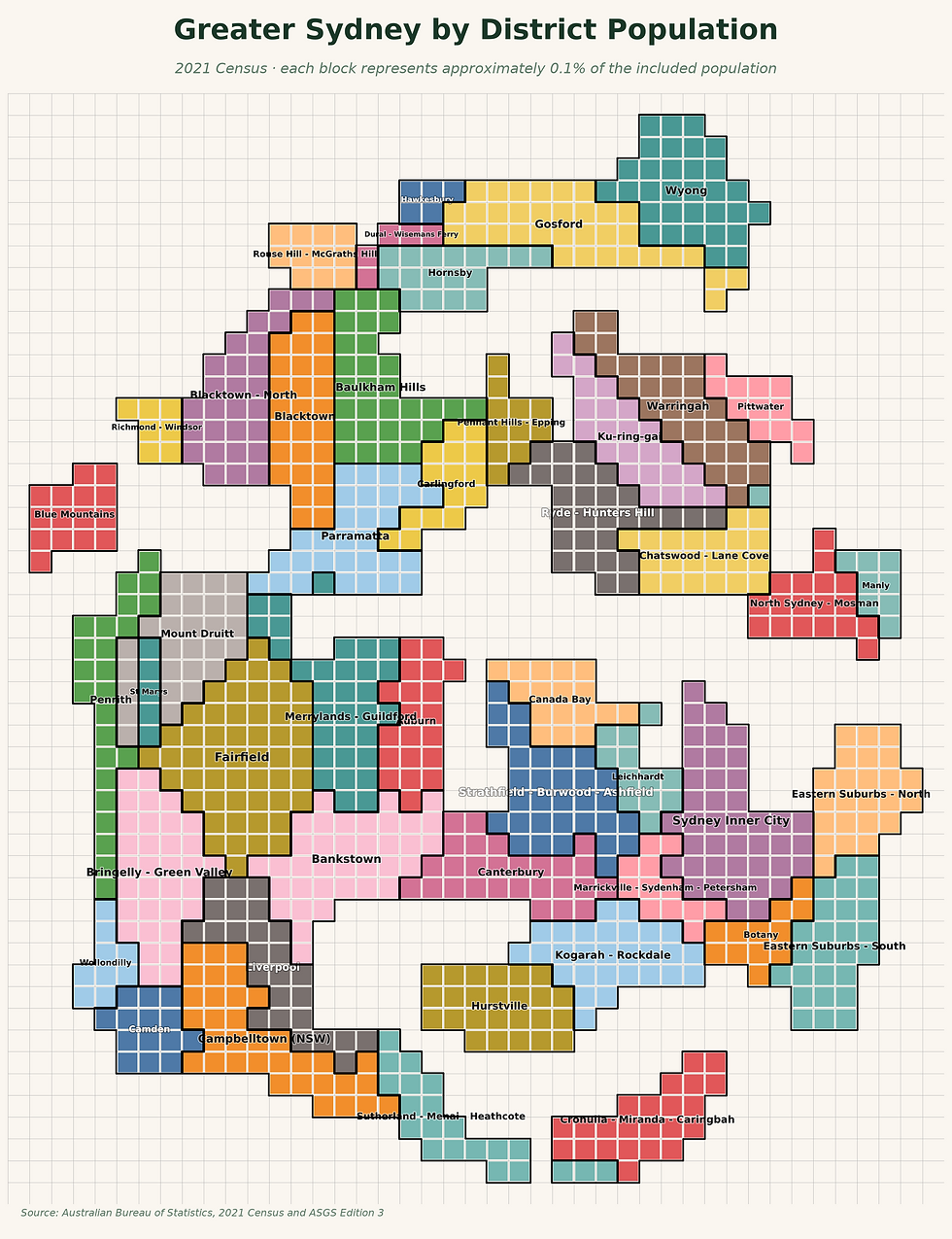
The repository is not restricted to its bundled countries. Both grid classes provide from_geodataframe, which means a project can supply its own polygons and weights:
Here we obtained census and geography data from these sources
This produces the following cartogram
The weight does not have to be population. A custom cartogram could size regions by:
hospital beds;
renewable-energy generation;
public-transport trips;
building approvals;
fire incidents;
agricultural production.
That flexibility is where the repository becomes especially useful for exploratory analysis.
The caution is equally important. A cartogram makes the chosen weight visually dominant. The weight therefore needs a clear definition, a consistent unit, and a defensible aggregation level. A dramatic distortion can be mathematically correct and conceptually pointless.
Where This Can Go Wrong
The population snapshot is not live
The Australian values bundled with the package are from 2021. A reproducible historical snapshot is useful, but the year must appear in the title, caption, or source note when the map is published.
The final block count is approximate
The repository notes that edge fitting and quota rounding can produce a final cell count slightly above or below the target. “1,000 blocks” is a construction goal, not an inviolable constitutional clause.
State averages hide internal geography
New South Wales contains Sydney and vast lower-density regions. Victoria contains Melbourne and substantial regional areas. A state-level score does not describe how people are distributed inside the state.
A city, local-government-area, or statistical-area analysis would reveal different patterns.
A cartogram is not a locator map
The deformed cells preserve a broad spatial relationship, not exact coordinates. They should not be used to identify the location of a facility, hazard, or observation.
The metric depends on the comparison set
Removing or adding territories changes the national totals and therefore changes every share. The inclusion rules need to be stated and applied consistently.
Population is not automatically the right denominator
Many social indicators should be compared per resident, per household, per worker, per square kilometre, or per unit of exposure. A population cartogram is useful only when population is relevant to the question.
Final Thoughts
As already mentioned popgrid is not a predictive modelling library. That is not a criticism.
It solves a different problem: it changes the visual unit of a map from physical space to a selected quantity while preserving enough geography for the comparison to remain recognisable. Used alone, it produces an effective cartogram.
Combined with Pandas, official reference data, and a carefully defined metric, it becomes part of a useful exploratory spatial-analysis workflow. The Australian example shows the division of labour clearly: the cartogram reveals the distortion, the table measures it, and the score makes the regions comparable.
A conventional map asks how much land a region occupies. A population cartogram asks how much of the country lives there (or whatever other amount was counted as we saw above in the custom data example).


Comments