Australia Is on Fire, According to a Satellite with a Clipboard — Part II

Updated: Jul 5
In the first part of this series, we obtained a table full of FIRMS detections. That is useful, but it is not yet a story, rather it is a pile of coordinates, timestamps, confidence labels, and thermal signals. Somewhere inside that pile are patterns: where the satellite saw active fire, when detections arrived, which cases burned in short pulses, and which ones kept showing up again and again.
In Part I, we did the bookkeeping work. We defined the fire cases, queried NASA FIRMS in five-day chunks, cleaned the acquisition timestamps, filtered the confidence classes, cached the CSV files, converted rows into point geometries, and made a simple Australia-wide case-location map to see where the location are that we are looking at.
Now we want to ask more interesting data-relevant questions. These are by no means not exhausitve and is still a bit of an overview of what one could ask.
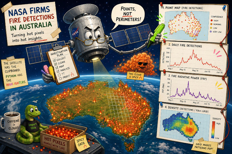
A point map asks where the detections happened. A timeline asks when activity spiked. A Fire Radiative Power plot asks whether the thermal signal followed the same rhythm as the detection count. A grid asks where detections repeatedly clustered strongly enough that the individual dots start to blur into a spatial pattern.
None of those plots is a fire perimeter. None of them is an official incident map. The satellite is not flying around with a clipboard, a hard hat, and local council authority. FIRMS gives us active fire and thermal anomaly detections observed at particular satellite overpass times. That is powerful enough to be useful, but one should always remember the limits in the data.
A point map is only the first question
The detailed case maps are the natural place to start because they look the most like what people expect from fire data: red-yellow points on a map, grouped around a place where something clearly happened.
But the useful version is not just “plot points and hope for drama”. The map should carry three pieces of information at once:
where each detection was recorded,
when it appeared relative to the first detection in that case window,
and how strong the thermal signal was, using Fire Radiative Power as a rough visual cue.
The plotting function starts with the cleaned all_fires table from Part I and selects one case at a time.
This version makes one figure per fire case instead of squeezing all cases into one row of subplots. That is less compact, but otherwise we cannot see anything. Each incident gets room for its own title, legend, explanation box, and output file. The figure can breathe, which is more than can be said for many matplotlib layouts after the third colour bar arrives. The code itself is quite self-explanatory. We get our coordinates, converted to the correct CRS, and get our background map. Then we add the points and add some extra information. The colour tells us when this heat source was detected in comparison with the very first heat source found in the area. The size of each marker shows us how big it got. Then we add the explanation box and label everything.
Examples for the output are the following.

We cropped the title and explanation box here to make it fit better. What one can see is where in the area measurable heat sources appeared, the more towards yellow the color, the later the heat source was detected. Since the points are plotted with ascending time data, this tells us how long the fires lasted in different areas.

In this example from Grampians in the summer of 2024 to 2025, we can see that a fire broke out and then essentially moved over to the west into a second wooded area later one.
Projecting the fire points onto a basemap
This is where the projection lesson from the earlier GIS posts comes back with a clipboard of its own. The FIRMS coordinates arrive as longitude and latitude in EPSG:4326. Web tile basemaps, including the ones that contextily uses, live in Web Mercator.
So the points need to move into the same coordinate world as the basemap:
points = make_points(part).to_crs(WEB_MERCATOR)The bounding box has to follow them:
bounds = gpd.GeoSeries(
	[box(*case.bbox)],
	crs="EPSG:4326"
).to_crs(WEB_MERCATOR)
west, south, east, north = bounds.total_bounds
If the points stayed in longitude and latitude while the basemap used Web Mercator metres, the plot would still run. That is the annoying part, since it would simply be wrong in a quiet, plausible-looking way, which is the most dangerous kind of wrong map.
The background is added with contextily:
cx.add_basemap(
    ax,
    source=BASEMAP_SOURCE,
    zoom="auto",
    attribution_size=7,
)
The images above were made with the basemap
BASEMAP_SOURCE = cx.providers.OpenStreetMap.MapnikBut to get a map without labels that interfere, the better basemap source is:
BASEMAP_SOURCE = cx.providers.CartoDB.VoyagerNoLabelsThis map still has a useful colour palette and geographic context, but it avoids most of the label clutter that would compete with the fire detections. Since we want to give a good idea for the sense of scale here, OpenStreetMap Mapnik was used. That looks nice, but the cleaner version from Voyager is more appropriate for a data supporting map.
Colour means time, not certainty
The most important new plotting column is day_number.
points["day_number"] = (
    points["acq_datetime_utc"] - points["acq_datetime_utc"].min()
).dt.days
This column says how many days after the first FIRMS detection in that case window each point was recorded. A point coloured as day ten was detected ten days after the first detection in the selected data.
That gives the map a rough time texture. You can see whether detections appear in one place early and somewhere else later, or whether activity keeps returning to the same broad area.
It does not say when the fire truly began. It does not say how long the satellite failed to notice a particular flame. Later colours can happen for many reasons: the fire spread, a new hotspot appeared, cloud or smoke blocked an earlier view, the fire was too small or cool to detect at first, or the burning happened between satellite passes.
The point size uses Fire Radiative Power, clipped so one very strong signal does not turn the map into a one-dot dictatorship.
marker_size = points["frp"].clip(lower=0, upper=40).add(2)This is a visual cue for the strength of the thermal signal. It is not a burned-area measurement. Bigger points mean “stronger detection in this plotting choice”, not “this exact circular area burned”. The choices made here, were also made for the purpose of this blog. For a real life data driven image we should probably look at smaller areas where the markers do not overlap that much to get a better view.
Daily detections — the satellite’s fire rhythm
The map gives us geography, another question could be timing.
For that, we collapse the detections into daily counts. This is less visually cinematic than a point map, but it is often more useful. A timeline can reveal whether a case was a short sharp burst, a long noisy burn, or a sequence of separate pulses hiding inside one date range.
The whole plot comes from one groupby:
daily = (
    all_fires
    .groupby(["case", "acq_day"], as_index=False)
    .agg(
        detections=("latitude", "size"),
        total_frp=("frp", "sum"),
    )
    .sort_values(["case", "acq_day"])
)
That gives one row per case per day. The detections column counts rows, so how many fire incidents were there on that day in the case's area. The total_frp column sums the Fire Radiative Power values for the same day, or simply said it sums up how much heat was given off by the detected incidents on that day in that area.
The y-axis label says “Nominal/high-confidence VIIRS detections” on purpose, remember that in Part I, we filtered the confidence field to keep nominal and high-confidence detections only. The chart should say what it actually counts, not what would make a neater headline.
This is also where comparisons become a little more honest. Raw detection counts are affected by bounding-box size, query duration, satellite overpasses, fire behaviour, cloud, smoke, and the confidence filter. The timeline is not a severity ranking, rather it is a rhythm section. If you look yourself at the different cases you will see that they are deliberately chosen to be very different.

To make the image a bit easier to digest we split the earlier and later cases and went to a logarithmic scale. These are easy modifications that would just make the code longer, so the above code is the simple, one plot image.
Fire Radiative Power — useful, but not burned area
The companion plot keeps the same daily table but switches the y-value from detection count to summed Fire Radiative Power.
Detection count and total FRP can tell different stories. A day with many small detections may have a high count but only moderate total FRP. A day with fewer, stronger detections may have a lower count but a larger summed thermal signal.
That makes the FRP plot a useful second opinion. It does not replace the detection timeline; it is simply a second viewpoint.
We can look at an example again.

Again we swapped to a logarithmic scale and two images to make it easier to read in the post.
Turning points into a grid
Point maps are good until they are just overlapping all the time. Once detections become dense, the reader stops seeing individual events and starts seeing a cloud, coloured in different shades or red, orange, and yellow.
A grid gives us a different view. Instead of asking “where is every point?”, it asks “which cells received repeated detections?” This is not quite raster data in the file-format sense, but it starts to think like a raster: space is divided into cells, and each cell receives a value. If one wants, one could create raster data out of this approach as we used in the third part of the GIS series of posts.
The grid builder is deliberately simple.
The default cell size is 0.05 degrees. For a quick exploratory map, that is fine. For measurement-grade area work, the grid should be build in a suitable projected CRS instead. Longitude and latitude degrees are convenient, but they are not equal-area measuring sticks. Especially if maps of different fires need to be compared, this would have to be changed.
Now we count points into those cells.
The spatial join does the interesting work.
joined = gpd.sjoin(points, grid, predicate="within", how="left")It asks GeoPandas which grid cell contains each point. The matched cell index appears as index_right, and then a normal Pandas groupby turns those matches into counts.
counts = joined.groupby("index_right").size().rename("detections")Those counts are joined back onto the grid. Empty cells are filled with zero and then removed, because a huge rectangle of empty cells is technically complete but visually about as exciting as a spreadsheet eating plain toast.
grid = grid.join(counts).fillna({"detections": 0})
grid = grid[grid["detections"] > 0]
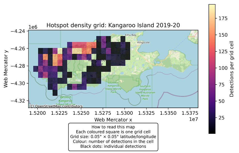
The final map shows the coloured grid cells and keeps the individual detections as tiny black dots underneath. The dots are left so that one can see the pattern, for an analysis map, we would probably remove them. This is a perfect situation that shows us how useful spatial joins can be. It becomes trivial to group points into cells without much extra work. This is especially useful if instead of a simple grid one would have used things like council area boundaries.
For an example we get the following.
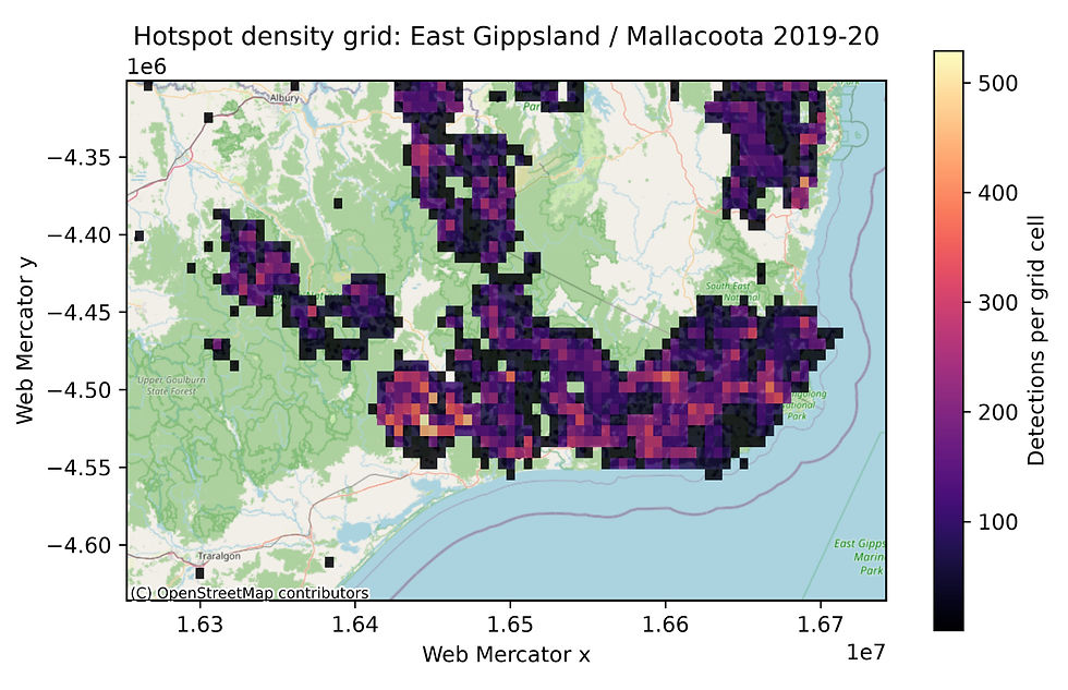
We again cropped out the explanation box to fit the blog format, those can be found in the script above. This shows which grid areas had the most detections over all. An alternative colouring would be to not simply count detection, but really sum up the thermal energy registered from all those detections in the grid.
Another small example, this time with the explanation box included as it fits neatly, would be the following.
Reading the maps together
Each plot answers a different question, as mentioned of course with a few compromises to fit the blog format.
The point map asks: where were the detections, when did they appear relative to the first detection in the case window, and which points had stronger thermal signals?
The daily detection timeline asks: when did the satellite record more or fewer hotspots?
The FRP timeline asks: did the summed thermal signal follow the same shape as the detection count, or did a smaller number of stronger detections change the story?
The density grid asks: where did detections repeatedly cluster strongly enough to survive aggregation?
Looking at all of them together is much better than forcing one heroic master plot to answer everything. Fire data is spatial and temporal. If we flatten it into a single number too early, the analysis becomes tidy but not very useful.
The most important warning also belongs close to the figures: the density grid is not a burned-area map. A coloured cell means detections fell inside that cell during the selected window. It does not mean every part of the cell burned uniformly. The satellite detected active fire or thermal anomalies there often enough to count. That is a useful starting point, not the final report.
The workflow
The bottom of the script turns the functions into a repeatable plotting workflow.
This creates the overview map from Part I, the two daily plots above, and then two case-specific maps for every fire case.
That is the real advantage of putting the plotting code into functions. Once the data is cleaned and cached, the script can regenerate the whole figure set without manual clicking, copying, or remembering which plot used which basemap. The human gets to make interpretation decisions, while Python gets to do the repetitive part.
Where to go next
There are lots of angles to go from here. A natural next step would be to turn the case list into a small Streamlit app. A dropdown could choose the fire case, source product, date range, confidence filter, and plot type. That would make the workflow easier to explore without editing the script each time.
A second useful extension would compare VIIRS and MODIS. VIIRS generally gives finer detections, while MODIS has a longer historical record. Looking at both products for the same case would show if there is disagreement between different sensors.
A third extension would add official burned-area or incident perimeter data. That would move the analysis from “where did the satellite detect active fire?” toward “how do active detections relate to mapped burned area?” Those are related questions, but they are not the same question. This one is of course much more difficult to obtain, as we don't have a good source for the GIS data of actually burned areas.
For this post, the workflow is complete enough to be useful. We start with a list of fire cases, talk to NASA FIRMS, cache the CSV data, clean the timestamps, map the case locations, and then produce static visual summaries of location, timing, thermal signal, and density.
The complete source for this part as well as the next can be found in this GitHub repository.


Comments